• bricks2My old friend Martyn tells a lovely story about one of the most important jobs he’s done during a lifetime of working on building sites – distracting the Site Agent.

    Basically this exploits one of Martyn’s superpowers, the ability to talk to anyone, for quite a long time if needed. This superpower comes into play when there is a ‘bit of a nuisance’ Site Agent involved. Site Agents are those people who: check up, keep things on track, make sure standards are complied with and report back to someone in a senior position. I’m sure you recognise the role. This story may relate to a Site Agent, but you could equally apply the principles to regulators, inspectors or even auditors…

    Martyn’s task in the case of this Site Agent was to distract him so that the rest of the brick laying gang could get on with the serious job of building houses. As it happens this particular Site Agent was a distractionist’s dream. An ex-serviceman, so all Martyn needed to do was mention something with a military connection. The resulting conversation would continue until home time and there were no irritating checks and unnecessary inspections. Brilliant, everyone was happy – except the trainee brickie – who had to carry his own concrete blocks while Martyn was distracting.

    Six Ways to Deal with an Ofsted Invasion.  This nugget was recently published by the Times Educational Supplement (a serious grown up publication) and you can also find it on the author Matt Bromley’s blog.  I’d recommend reading it to anyone who’s involved in inspection, regulation or audit.

    For some it might just confirm everything you’ve always suspected about inspected bodies, they see Inspectors as ‘the enemy’, and have ‘tactics’ to ‘thwart their attack’. Alternatively, you might be appalled at the idea of inspection being seen as anything other than a positive experience. A transparent collaborative process where everyone comes away feeling like they are in a better place. I’ll leave it to you to decide where you sit on that spectrum…

    Here are Matt Bromley’s Six Tips for dealing with an ‘Ofsted Invasion’ (with some summarising)

    1. Pick Your Battles. Know your strengths and defend them. Be prepared to make sacrifices and sustain ‘losses’ where necessary (see #7 later)
    2. Prepare Colleagues for Meetings. Basically this means getting everyone briefed and on message.
    3. Debriefing Meetings. Find out what as been said, quickly. It might give you pointers about where the Inspectors are looking so you can do more preparation.
    4. Prepare Position Statements & Briefings. This ‘does what it says on the tin’. Have your version of the truth ready to hand to the Inspectors.
    5. In-Year Data. Have details of how things are performing now (unless its worse than last year, you might want to hold onto that).
    6. Impact, Impact, Impact. Have everyone prepared to explain the impact of what you do and answer the ‘so what?’ question.

    #7 Satisfaction of Search Bias.  This one is my suggestion. I’m going to stay neutral here and offer it as something that Inspectors should be aware of, and the ‘Inspected’ should not be trying to exploit – you are only cheating yourself in the long run (said sincerely and as un-self-righteously as possible).

    The basic idea is that, once you’ve found what you are looking for, you don’t put too much effort into looking for anything else. There might be a potential disaster waiting around the corner, but you stop looking, happy with the ‘prize’ you are holding.
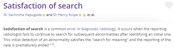
    Satisfaction of Search
    Definition from Radiopedia
    Research on the topic involves radiographers who fail to see additional abnormalities once they have already spotted one. Satisfaction of Search in Osteoradiology, published in the American Journal of Roentgenology should help if you are looking for some academic rigour. I stumbled across the reference after reading this from Liz O’Brien on MedPage Today, Beware the ‘Satisfaction of Search’, taking about it from the perspective of a proof reader. It is worth stopping to reflect, “have I stopped looking because I’ve found something?” I know I probably have.

    Be more like Salvo Montalbano. All of this research and science is fine, but we know this stuff already… Well, we should if we’ve ever read a detective novel or watched any of the ‘good’ detective films and shows. The plots will generally have an ‘obvious but wrong’ option and a ‘right but harder to work out’ storyline. This is one that the clever (but emotionally flawed) detective manages to work out – despite the the blundering interference of superiors.

    Inspector Montalbano, the Sicillian Detective (Star of Saturday night BBC4) is (in my view) the finest example of this approach. That’s all I want to say on the matter.

    How would I respond to an Inspector Invasion? I’m not going to answer that directly, just give a few examples of tactics that some of my ‘acquaintances’ have owned up to:

    • A Lavish Lunch. Particularly if the Inspectors have travelled a long way and are heading back at the end of the day.
    • A Welcome Committee in Reception. Apparently this helps ‘get them on board’, and a car parking space by the front door does no harm.
    • A Well Placed ‘Error’. Totally in the exploitation of ‘satisfaction of search’ territory.
    • There must be hundreds of these, we could make a list…

    It’s not about winning* and it takes two to Tango. I not naive enough to think that this sort of thing isn’t widespread. Neither am I daft enough to think this is a one sided story. It is a concern though. Adversarial approaches to inspection don’t help anyone. Too much effort is put into ‘playing the game’ and trying to outsmart each other. Much better to spend the time and resources working together to deliver a better service or product.

    So, What’s the PONT?

    1. Too much effort is wasted in ‘battles’ between Inspectors and the Inspected. Better to work towards better process and products rather than trying to outsmart each other.
    2. It takes two to Tango. It will take both sides to change this situation.
    3. Satisfaction of Search is definitely something to be aware of. Just try to be ‘more like Salvo Montalbano’, I know I am. Caio

    #BemorelikeSalvo
  • 7cd08c3b-aec9-4566-b921-9a1bc4dd74e4-22795-00001877943edfcf
    I didn’t choose Tug Life, the Tug Life chose me. Toot toot!
    Developing the nautical theme, I’m guessing you’ll be familiar with the Boaty McBoatface saga? The 2016 online poll to name the UK Government’s £200 million Arctic Research Ship? It actually ended up being called Royal Research Ship Sir David Attenborough (sigh…), despite Boaty McBoatface clearly winning the poll with over 124,000 votes! It’s explained in this Guardian article, ‘tyrants have crushed the people’s will’. I wanted number 4 (10,000+ votes) to win, ‘RSS It’s Bloody Cold Here’, just imagine the Coastguard calling that over VHF Channel 16…

    “What about democracy?” I hear you cry… surely the people should get what the people voted for. Well that’s great if the people (the crowd) have made a wise decision. The Boaty McBoatface saga neatly illustrates that large groups of people (crowds) don’t always make good (wise) decisions, and if you add the Internet into the mix you can get some very peculiar outcomes.

    If you want some more evidence of peculiarity have a look at 15 Polls Hijacked by the Internet. You might actually agree that the Internet got it absolutely right in voting for Canadian popster Justin Bieber to be sent to North Korea. However naming a new flavour of the beverage Mountain Dew, “Hitler did nothing wrong” is an astonishingly bad result in anyone’s book.

    Participatory Budgeting and the Wisdom of Crowds. What this post is actually about is participatory budgeting. I’m running the international maritime ‘U’ flag up the pole. ‘Full steam ahead’ into participatory budgeting waters (using online methods) could lead to all sorts of unintended outcomes, like Boaty McBoatface. So, it’s worth paying attention to the ‘U’ flag and beware of ‘running into danger’. That said, it’s not a reason to go full astern; more like proceed with caution.

    img_7731Participation in decision making is a good thing. Just to set the record straight, there are many good things about participatory budgeting, and a lot has been written about it (believe me, I look this stuff so you don’t have to).
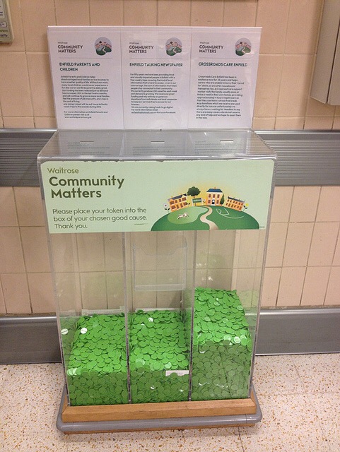
    A little while ago Nesta published ‘unlocking the potential of participatory budgeting’ and in Wales, the Public Policy Institute have recently updated things in Participatory Budgeting, An Evidence Review.  What is common to the mountains of analysis and reviews are descriptions of the benefits of participatory budgeting, basically:

    • Improved Engagement – citizens will be more engaged in the decisions made on their behalf through being involved in the actual process,
    • Better Understanding – between different groups in a community through the process of thinking about other people’s requirements during the decision making process,
    • Increased Confidence – of citizens as they become skilled at understanding and deciding what to do, and
    • Greater Respect and Understanding of Public Services – as citizens get to understand the difficult and valuable work they do through engagement in the process.

    These are all very good reasons for participatory budgeting, but I do quite often struggle to find the following statement written anywhere… “You Will Get Better Decisions”. 

    When does a crowd make wise decisions? As with participatory budgeting there is plenty that has been written about the ‘Wisdom of The Crowd’ and the opposite phenomenon, ‘The Tyranny or Stupidity of the Herd’. I did write about ‘The Wisdom of Crowds, Flappy Birds, Tulip Mania and The Tyranny of Herds’ a while back. If you fancy something a bit more grown up I’d recommend this blog by Julie Simon from Nesta, ‘When is the crowd wise, or can people ever be trusted?’

    This is a really good explanation of a complex challenge and it also opened my eyes to the work of Austrian Friedrich Hayek and his 1945 work ‘The Use of Knowledge in Society’. A key point for me is how Julie Simon summarises it; “there is wisdom within crowds – it’s just that it’s domain specific, unevenly distributed and quite hard to transfer”.

    Is the Crowd Wise? Getting back to this question…..the short answer is, ‘it depends’. There are some very specific circumstances that are needed to extract a ‘wise’ decision from a crowd. These are summarised in James Surowiecki’s book ‘The Wisdom of Crowds’ and the Wikipedia article Wisdom of the crowd. I had to include the Wikipedia link as apparently Jimmy Wales (Wikipedia founder) was greatly influenced by the work of Friedrich Hayek on knowledge in society (crowds).  For completeness, here are some the criteria necessary to extract a ‘wise’ decision from a crowd.

    • Competency in the subject – you need to know something about what’s going on. Complete ignorance isn’t likely to be helpful.
    • Independent ‘voting’ – people need to express an opinion or vote without seeing what others have done. If you see what others have done there is a tendency to ‘anchor’ your response to theirs (going higher or lower).
    • Diversity of views – a greater difference in what people think overall will generate a better result
    • Numeric or clearly defined issues seem to work better than asking the crowd to decide on something complex or an ambiguous challenge.

    Trainy McTrainface. Finally there is one other ‘rule’ to follow.  If you are going to ask the crowd for their opinion, be prepared to act upon what they say (or don’t bother).

    There was a fair bit of backlash against Boaty McBoatface being overruled with Sir David Attenborough. You run the risk of creating a more disengaged crowd than when you started. I know that if I’ve been asked for my option and ignored, I’m unlikely to be as willing to contribute a second time… why should I trust you to listen?

    The Swedish rail company certainly listened, and have ended up with Trainy McTrainface for their troubles. And the moral of the story is….

    So, Whats the PONT?

    1. There is wisdom within crowds. Extracting it isn’t straightforward though. There are things you need to do to make sure you get to the wisdom (and not something else).
    2. There are may benefits to participatory budgeting, but be cautions, learn lessons from the wisdom of crowds experiences.
    3. Never ask the internet to name anything – unless you plan to live by the results.
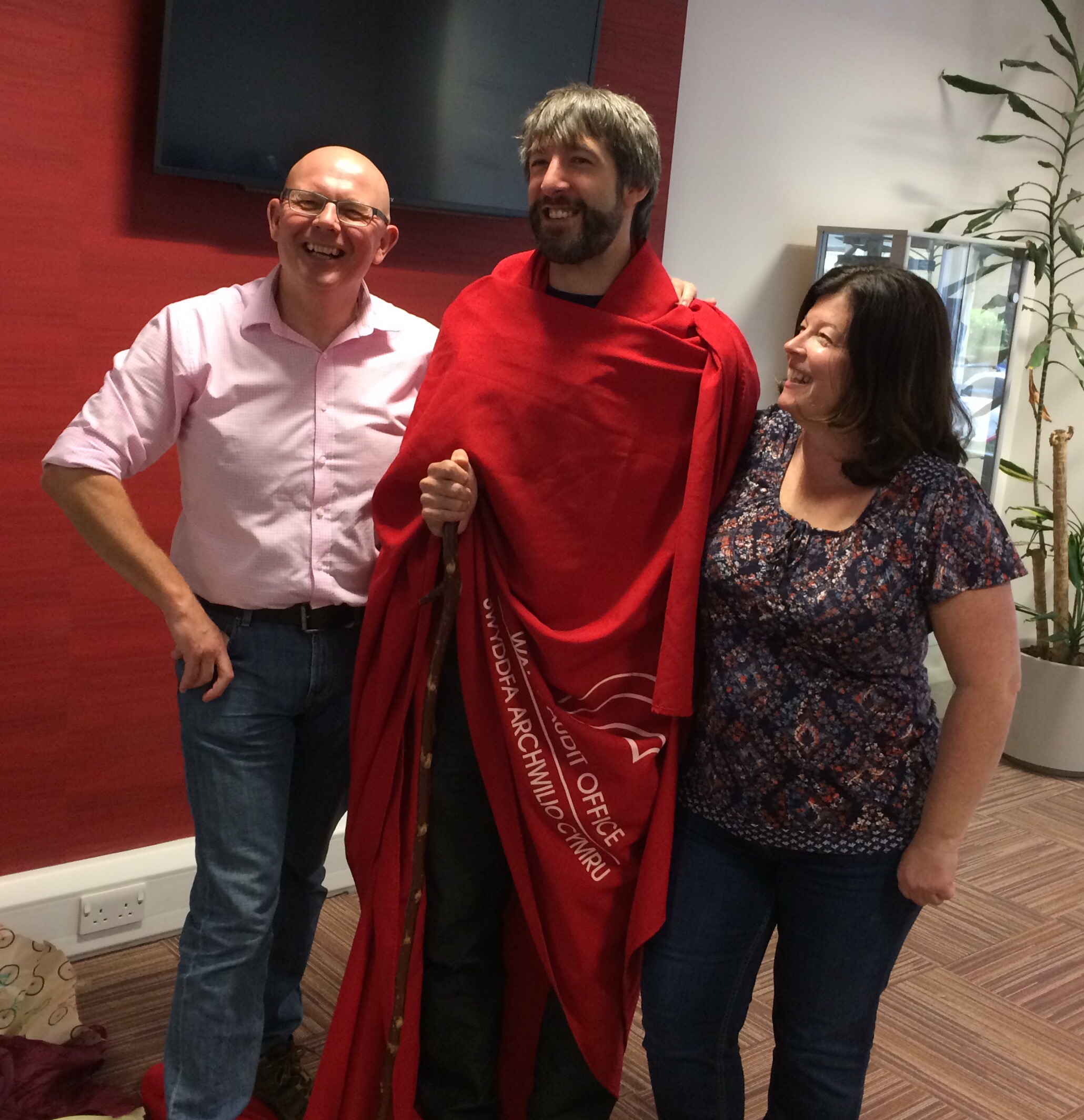
  • Dyfrig Williams modelling the latest in Anti Decision Fatigue clothing -‘a strong look’

    I’m scenario planning at the moment. Please reflect upon this situation. I walk into the office and someone says, “Chris, you filthy minger(*), that’s the same clothes you’ve been wearing for the last 5 days, you smell like a Pole Cat”. My response is as follows:

    • I carefully appraise their swanky outfit,
    • Slowly fill my lungs and say, “You’ve got it all wrong…”
    • This is my anti decision fatigue uniform
    • It has been carefully chosen to reduce the cognitive load placed upon me by my work
    • Look it up in the Mindfulness Section of the staff intranet.
    • followed up with…
    • “Oh, and if you don’t believe me, why do you think Steve Jobs, Mark Zuckerberg and The Dalai Lama all wear/wore the same outfits every day?
    • I’ll have you know it’s the secret of their success!
    • I then stride purposefully to my stand-up desk.

    Brilliant eh, but you may have spotted some flaws in this scenario:

    1. Jobs and Zuckerberg probably had/have enough money to own a set of clothes for every day of the year. 365 pairs of jeans – check, 365 Gap hoodies – check, 365 back turtle neck sweaters – check. You get the picture and that means they also avoid the ‘smelling like a Pole Cat’ situation.
    2. The Dalai Lama – I might be way off the mark here. Robes worn by a Nation’s Spiritual Leader and office garb probably aren’t a good comparison. Although, do check out the picture my former colleague Dyfrig (@DyfrigWilliams) draped in a conference table-cloth – a ‘good strong look’ as he might say. There’s a future in this I reckon.
    3. Jobs and Zuckerberg also come from work environment where it seems to be perpetual dress down Friday. That’s not what I encounter on most of my travels.
    4. Some people love to ‘peacock’. What to wear to the office is a competitive sport and they wouldn’t be seen dead without a different; perfectly matching, shirt and tie or shoes and handbag combo, every day.

    We make 35,000 decisions per day.  There is a serious point to this. I’m aware of the idea that one of the consequences of modern life is that we are faced with huge amounts of data and information to process. This boils down to thousands of decisions and choices (Should I do this, or should I do that)? Just scroll through your Twitter feed for 5 minutes and have a think about how many decisions you made to read or not read a Tweet.

    To cope with the huge volume of information and decisions, we have developed a series of ‘mental short-cuts’ and other coping mechanisms. It is the impact of these short-cuts and coping mechanisms that I’m interested in; but I’ll have to get around to that in the next post. What I want to focus on is numbers and scale for the moment.

    35,000 is a big number, particularly if you look at it from the perspective of making that many decisions every day – it’s over one per second. The thought of that alone is mentally exhausting!

    There is plenty of debate about whether this is the right number. It depends upon how you define decision (how much thinking do you need to do before you act) and where is the boundary between conscious and unconscious thinking. It is worth having a look at this video ‘How many decisions do you make per day?’ from @Dominating Drew for a more detailed explanation.

    Avoiding Decision Fatigue. With such a huge number of decisions to process every day it’s not unreasonable to think that we might get ‘tired’ or ‘decision fatigued’. We become less effective at making decisions after a long day, particularly if it’s involved lots of tough thinking to inform the decision making.

    There are some really interesting consequences of this that range from;

    • Judges being more likely to free prisoners early in the day, compared to other times;
    • Impulse purchases (close to the checkout) after a long shopping trip to the supermarket; and
    • Reckless behaviour late at night from Chief Financial Officers, after a hard day decision making.

    It is worth reading this article on Decision Fatigue, and some of the articles it refers to. They might be helpful if you ever have to explain some ‘late night reckless behaviour’……perish the thought!

    What has this got to do with wearing the same clothes every day?  Apparently, some people who are faced with many and difficult decisions on a daily basis, choose to reduce the decision making burden. This involves having no decisions to make about – what do I wear today? It’s easy, the same as yesterday, and the day before, and tomorrow.

    Interestingly it is ‘powerful men’ that are mostly mentioned in this context. This UK Business Insider article specifically identifies Barack Obama, Steve Jobs, Mark Zuckerberg (Simon Cowell has also been mentioned, thanks Kate Carr for that mental image of high waist trousers).  I do suspect that decision fatigue and issues around clothing also apply to powerful women, although there is the added pressure of what they wear being intensely scrutinised by the media. Alternatively, women might just be better at dealing with the ‘getting dressed in the morning’ challenge than most men?

    So, What’s the PONT?

    1. We make a huge number of decisions every day. To deal with this we have developed many mental short-cuts and coping mechanisms (see the next post).
    2. Decision Fatigue is a consequence of a heavy burden of decisions making that we need to be aware of.
    3. Wearing the same clothes every day might be a coping mechanism to reduce your decision making load and fatigue. But do remember to change and wash then from time to time, you wouldn’t want to end up smelling like a Filthy Minger Pole Cat.

    (*) Please note that ‘Filthy Minger’ is a phrase that is used locally, often as term of endearment. I should also point out that my colleagues would never say this sort of thing, it’s just a scenario.

  • “A single death is a tragedy; a million deaths is a statistic”, an astonishingly callous sentiment that’s been attributed to Joseph Stalin. There are doubts about who said it first, it does sound like something ‘Uncle Joe’ might have said, so if the cap fits…

    Analysis of the quote’s meaning broadly runs along the lines of:

    • the death of a single person (known or unknown), can be understood at the human, person to person scale. We have capacity to feel upset about it.
    • For situations where high numbers of people have died the impact upon us decreases. We tend to no longer relate ‘person to person’. The situation can be too complicated and emotionally difficult to understand and cope with. In the words of Stalin, deaths become ‘statistics’.

    If you are interested in the phenomenon described as ‘collapse of compassion’, have a look at this article by Keith Payne in Psychology Today.

    One Volcano Death is worth 38,920 Food Shortage Deaths.

    Reading this post, ‘How many deaths make a natural disaster newsworthy?’ on the Our World in Data blog that reminded me of the Stalin quote.

    The post summarises 2007 research published by Thomas Eisensee and David Stromberg. It looks at how mass media reported on natural disasters, and the response from the public and governments. It used a substantial data set that covered 5,000 natural disasters between the years 1968 -2002, and the response in over 700,000 news stories from major US broadcasters.  The original paper, News Droughts, News Floods and U.S. Disaster Relief (link here) makes a number of important points:

    • Mainstream media was selective in what it reported. Reports did not necessarily reflect the severity of the disaster, or the number of people killed,
    • Incidents that were ‘spectacular’ or ‘rife with drama’ were reported ahead of those that were ‘less dramatic’, despite much higher casualties. For example 1 death linked to a volcano (dramatic, rapid and spectacular) would be the equivalent (in newsworthiness terms) to 38,920 deaths linked to food shortages (long-term and definitely not spectacular).
    • The geographic location of a disaster is also relevant. According to the data, 45 times as many people would have to die in Africa for it to have as much news coverage as a single death in Europe.

    Famine. The worst of both worlds.

    Included was a point about how disasters associated with food shortages often take a relatively long time to develop. However, they only tend to be reported once the situation has become extreme.

    Taking action to reduce the impact of food shortages, and saving lives is generally more effective if it happened as early as possible.

    However, relief and support tended to follow reporting by the mass media, after things have become ‘spectacularly’ bad.

    This feels like a terrible lost opportunity to prevent death and human suffering, partly due to a bias towards reporting the ‘spectacular’ and ‘dramatic’, rather than actual impact on people.

    When you consider this alongside the ‘collapse of compassion’ phenomenon and Stalin’s Statistics, a food shortage crisis really is the worst of all worlds. By the time mainstream media get around to reporting it, deaths have moved on from tragedies to ‘statistics’ in the minds of the mass media consumers.

    Has the Internet changed anything?

    That’s all thoroughly depressing, but something we should acknowledge. I’ve also pondered if the world has changed with multiple channels to share information via the Internet?

    The Eisensee and Stromberg research looked at 1968-2002 data. Since then editorial ‘control’ and the influence of mass media has apparently declined. With the internet there is far greater scope for concerned people to raise issues sooner, and mobilise action.

    So has anything changed? Unfortunately I don’t think so. Some major disasters (complicated, long term and unspectacular) still appear to be ‘off the news agenda’.

    771a50a8-e90b-4539-a69c-5236676f9bcd-370-0000003410f3cb4d

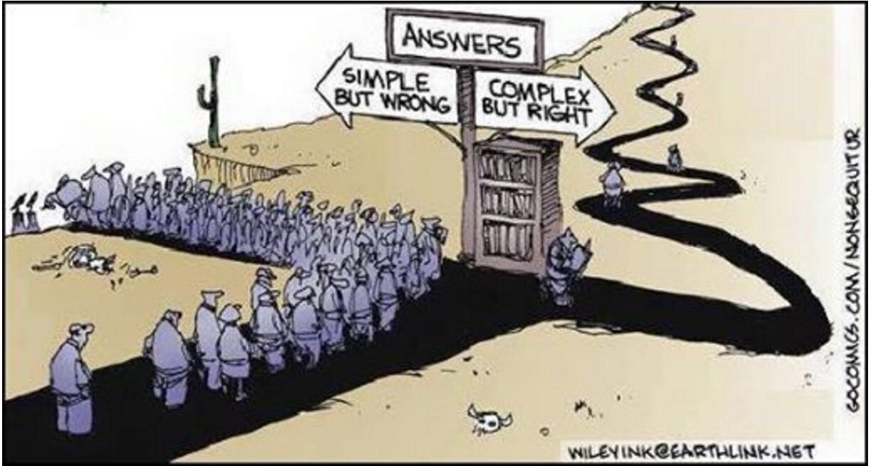
    Simple and Immediate or Long-Term and Complex. So where does this leave me? In a conversation with Shane Waring (@shanewaring) we came around to the idea that (many) people prefer to deal with information that is immediate and simple, rather than complex and long-term.

    It is much harder to think about and work through difficult and complex situations. Mental ‘shortcuts’ are much easier, and we can be drawn to the spectacular and short-term and depressingly things then get reduced to ‘statistics’.

    This cartoon by Wiley Miller at Non Sequitur sums it up perfectly. You may recognise this situation in what you see in the bits of world around you… just saying.

    So, What’s the PONT?

    1. It’s not just ‘bad’ news that makes the headlines, it’s ‘spectacular’ bad news.
    2. If someone pushes you to make a complex problem ‘simple’, stand back and ask why? Are they ‘simply’ looking for a mental shortcut to avoid the hard graft of thinking?
    3. Many people have a preference towards simple and immediate rather dealing with the complex and long-term.  It’s just the way things are…


  • img_7340
    It looks nothing like the picture on the box!

    I’ve tried all sorts of hobbies over the years. Probably my worst has been building Airfix models. It’s the glue. And the painting. And don’t get me started on those transfer things that are supposed to ‘slide on with ease’ to complete your masterpiece. There are several boxes of ‘bodged’ attempts lurking in our attic. I completely lack the dexterity and patience for that sort of skilled precision work, unlike my oldest son who is astonishingly good at it…

    Hello #TiL253…  Fortunately, for the people who appreciate a well-built scale model, over the last 18 months I’ve been occupied by #TiL253 (TiL = Today I Learned, 253 = number of TiL’s aimed for in a calendar year). This is basically me recording the bits and pieces I learnt, or find interesting, using the hashtag of #TiL253 on Twitter. The thinking behind it is all explained here in a blog post: #TiL253 (no longer and experiment).

    The long over-due promise of, ‘I’m going to do something with all this information’ has now started in earnest.  Over recent weeks I’ve developed a framework in SenseMaker (some details here) to try to bring things together and see if I can draw out anything useful from my random learnings.

    The Good News and OK News.  The good news is that I’ve carefully put 48 #TiL253’s into SenseMaker. The 48 are the first 2 months of 2016, about 19% of the target I was aiming for. So the first observation; I made a good start, which is probably fairly typical of a new hobby (especially one starting in January).

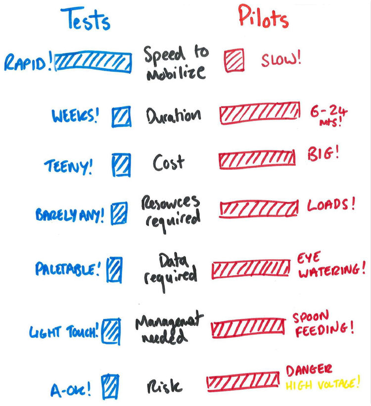
    Via Bromford Lab. Tests v Pilots

    The ‘OK’ News is that I’ve learnt a lot about the framework I’d developed for interpreting my TiL’s in SenseMaker. Basically my framework is not as good as it could be, but that’s OK; I’ve worked out what will work better. In the spirit of ‘safe to fail’ experiments, its cost nothing more than my spare time, which is fine for a hobby. I would also like to think I’ve been consciously following the advice of the Bromford Lab on small iterations, explained in this post ‘What’s the difference between a Test and a Pilot’, neatly summarised in this graphic.

    Learning from this test will be plugged into the next iteration of SenseMaker, which I’ll summarise in a follow-up post. In the meantime here is what did surface from testing the first two months of #TiL253.

    Numbers are accurate, but not always convincing; Narrative is convincing but not always accurate (Dave Snowden)

    When I looked at the TiLs from January and February 2016 I was trying to get a sense of what was important. Did it have a connection or resonance with people? Did it lead to anything useful happening? There were broadly three ways of looking at this:

    1. Twitter analytics; impressions, engagements, likes, retweets etc (lots of accurate numbers);
    2. Conversations with real people about the TiL (or related topics), this was sort of measurable by following the conversation thread on Twitter; and
    3. Things that happened as a result of the TiL, much harder to measure, but can be tracked through conversations (narrative).

    My main observations from this:

    • The Numbers: By looking at impact via numbers (Twitter analytics) I clearly identified the TiL that had the biggest number of impressions, engagements, likes etc. They were useful or interesting things for me and others:
      • A free course on making sense of health evidence;
      • A link to a font developed to help people with dyslexia;
      • A paper describing the evidence against Evidence Based Management; and
      • The concept of leaving a ‘Digital Exhaust’.
    • However, this analysis didn’t really excite me. These were ‘good’ TiL’s (the Twitter analytics numbers confirmed that), but they didn’t seem to have had any real impact as far as I could recognise.
    • The Narrative: I then had a look at impact which involved more of a subjective judgement by me. I based this on the sort of conversations the TiL had generated on Twitter (which are helpfully linked to the hashtag in a tread) and other conversations that followed.
    • The interesting thing  that emerged was a ‘cluster’ of TiL’s and conversation around a similar topic area; Astroturfing, Fake Social Media Accounts and the Creation of Deliberate Ignorance.
    • There was also one TiL that was common with those identified by numbers alone. This was about the concept of Minimum Viable Product, which also linked to a blog post I then wrote, so it might not be a pure example of a TiL.

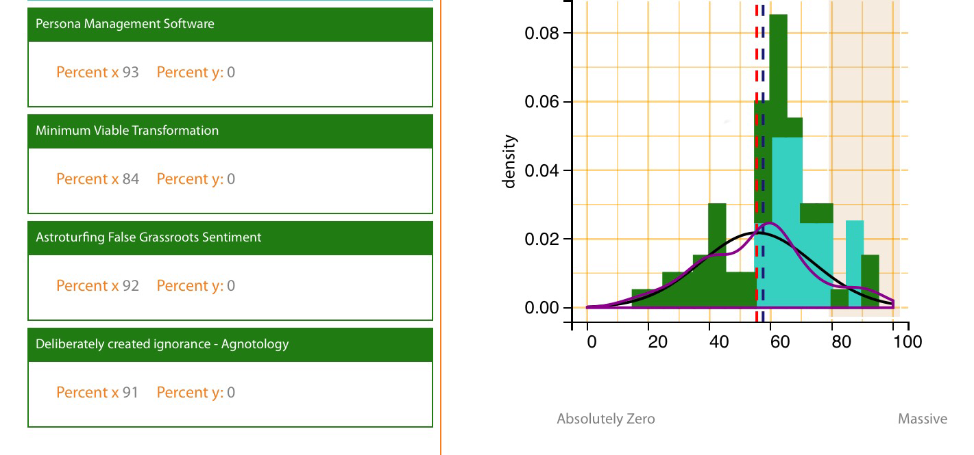
    Astroturfing, Persona Management Software,  the Creation of Deliberate Ignorance and #FAKENEWS! This really excites me. From the ‘What was the impact of the TiL’ scale, there were 3 TiL’s that grabbed my attention. They were about:

    • Astroturfing – the creation of false grass-roots sentiment on social media;
    • Personal Management Software –  fake social media accounts – the ‘tools’ that help you Astroturf; and
    • Agnotology – a process of deliberately creating ignorance.

    img_7346
    What sort of Impact did the TiL have? A scale of Zero to Massive. The 4 headings are from the above 80% area, close to ‘massive’ impact (this is all  subjective and relative).

    What was really interesting here were the conversations around the topic. People like Jon Beech (@_jonb), Tamsin Sterling (@TamsinSterling1), Janet Villars (@JanetAvillars) and the ubiquitous @ComplexWales were all involved and contributed something useful to the conversation.

    Did we foresee FakeNews? This might be a huge leap of retrospective coherence (making sense of things when you look backwards), but I do wonder if we were actually talking about the rise of Fake News?  This was January/February of 2016, long before the claims of social media manipulation and fake news (deliberately created ignorance) had made it into mainstream discussions. That all came much later on in 2016 mostly around the US Presidential Elections.

    As I’ve said this might be an example of over exuberant retrospective coherence by me, but there seems to be a conversation that was emerging, that pointed towards future events? What it has done is spur me on with the next iteration of my #TiL253 testing.

    So, What’s the PONT?

    1. Doing things in your spare time (a hobby) takes longer than working at it full-time, but it does allow for plenty of reflection and ‘slow thinking’. I like that.
    2. There’s a lot of truth in the Dave Snowden quote about Numbers and Narrative. I drew far more useful learning out of the narrative analyis that the ‘accurate’ numbers.
    3. The next stage of my test is to get closer integration of the Numbers and Narrative.  I’ve made mistakes and learnt a lot, but surely that’s the point of an experiment.
  •  

    This is the third in a series of posts (second one here) about some work using SenseMaker to get a better understanding of attitudes to risk. This final post explains how we used SenseMaker in a new way for us, looking at X-Y plots and possible correlations between data sets.  It is very much ‘work in progress’.

    Text from the original post is below, with the hopefully familiar ‘What’s the PONT?’ added at the end.

    Why involve service users in decision-making?

    There is currently a great deal of activity across Public Services in Wales to ‘involve’ citizen and service users. Things like the Future Generations Act Five Ways of Working (involvement) and the Prudent Healthcare Principles (co-production) all play their part in encouraging this behaviour.

    With all of this activity it is reasonable to ask the questions, ‘does involvement make a difference to service users?’ and ‘does it bring any benefits?’

    How do you ask a difficult question like that?

    When we mentioned we were testing the SenseMaker technology and pushing our understanding to the limits, this is it…

    We avoided asking the question directly by looking at the data from a slightly different angle.  We extracted data from two separate triangles, illustrated below (Graphics 1 and 2) that featured service users in some way:

    • Benefit felt by service users, and
    • Who can contribute most knowledge to the decision?

    A triangle where people moved the point to indicate whether decision makers, service users or workers benefit if things work out

    A triangle where people moved the point to indicate whether decision makers, service users or workers benefit if things work out

    Pushing our understanding, creating an X / Y Plot

    What we did next was to create an X / Y Plot which looked the benefit to Service Users and how much knowledge they contribute to the decision.

    Our thinking was, if there is a benefit to be gained by involving service users in decision-making, we should see a relationship on the X / Y Plot.  This would be most clearly seen by plotting a straight line through the dots. The basic idea we followed was:

    • If a line appears that runs left to right in an upwards direction, there is a positive relationship and service user involvement in decision-making leads to greater benefits for service users. The more involvement, the greater the benefits.
    • If a line appears that runs left to right in a downwards direction, the opposite is true. Service user involvement in the decision leads to less benefits for the service users.
    • A flat line would indicate no relationship between the two.

    What the X / Y Plots looked like

    A graph that plots service user benefit against how much service user knowledge informs decisions

    Graphic 3 All Data

    • The upward direction of the line suggests that there is a positive relationship.
    • The more the Service User knowledge is used to inform the decision-making, the greater the benefits for the service users.

    * see caveats at the end

    A graph that plots service user benefit against how much service user knowledge informs decisions. The ascending line shows a safe to fail approach, the descending line shows failure is not an option


    Graphic 4.  Different Frameworks

    • This shows the results when the data is split across the two approaches to risk management we presented:
      • Safe to Fail (light blue)
      • Failure is not an option (dark green)
    • There is an obvious difference in the straight lines through the dots.
    • The light blue line for the safe to fail framework suggest a positive relationship.
    • The dark green line (failure is not an option) suggests that greater involvement of service users leads to fewer benefits for them.

    Does the scenario make a difference?

    Another approach to examining the data was to look at the scenarios we used. Does the scenario influence how people think about service user involvement in decision-making. Broadly the three scenarios we considered were:

    1. Data sharing. A proposal to share data about service users between several organisations.
    2. Service user complaints. Improving the approach to complaints handling in a single organisation (formed from the merger of several organisations).
    3. Tackling obesity. A society wide issue involving multiple organisations.

    A graph that plots service user benefit against how much service user knowledge informs decisions. The sharply ascending looks at tackling obesity, with the flatter lines looking at data sharing and tackling obesity

    Graphic 5. Influence of the Scenario

    • The red line for the Tackling obesity data is very different for the ones for Data Sharing and Service User Complaints
    • The upward slope of the red line suggests that service user involvement in the decision-making process will have greater positive benefits for them.
    • The difference with the other scenarios could be explained by Data sharing and Service user complaints are more focused on arrangement between or within organisations, rather than something like tackling obesity which potentially has closer involvement with service users.

    So, does involving service users in decision-making lead to better decisions?

    Our analysis here suggest that in some situations the using knowledge from service users does lead to greater benefits for the service users.

    This is dependent upon the context in which the people who took part in this experiment were placed and how they were thinking at the time.

    There was a positive relationship where they were thinking about a ‘safe to fail’ situation, and a negative relationship in a ‘failure is not an option’ context.

    This might suggest that when operating in a ‘failure is not an option’ environment that service user involvement is not given as much weight compared to a safe to fail approach, suggesting that in a ‘failure is not an option’ circumstance service user involvement becomes less meaningful and more tokenistic.

    The scenarios we presented showed a considerable difference in how people responded.  For a scenario where there was likely to be a need to interact with service users (tackling obesity), there as a more positive relationship  than scenarios which were more focused on process and activity between and within organisations (data sharing and service user complaints).

    *Caveats. Please remember that there are huge caveats around this data and the limited analysis we have carried out, for example;

    • What influence would a larger, more diverse group of people have on the results?
    • What influence would the views of service users have on the results?

    So, What’s the PONT?

    1. For the group we ran this test with, they seem to recognise that service user involvement in decision-making (co-production) will lead to decisions that benefit the service users (which is surely the point of public services?).
    2. There are however some decisions that are probably better off taken without a prolonged discussion with the service user. To quote @ComplexWales  (Matt Wyatt) “I don’t want to be asked how I want to be defibrillated … just do it!”
    3. And getting right back to where this series of posts started, it’s all about the context. Understanding the context and using risk management and taking decisions that are appropriate in that context. There is no one size fits all or universal method that applies everywhere, all of the time.

    Finally. As mentioned earlier, this is an experiment for us and an example of us ‘working out loud, doing things in the open’. There is still a lot more we would like to do with this data. We are certain that we haven’t got things right and would appreciate any comments and feedback on what we have tried here. If anyone would like to have a look at the dataset and help expand our understanding, please get in touch, we would very much like to talk.

    This post is linked to others that look at:

  • This is the second of three post (First one here) about some work using SenseMaker to trying and get a better understanding of attitudes towards risk. In particular how ‘well manged risk’ works in relation to innovation and major changes.

    Text from the original post is below, with the hopefully familiar ‘What’s the PONT?’ added at the end.

    …This is the second post following a pilot session we ran on well-managed risk taking. An explanation of our approach to the session is in the first post, ‘Context is Everything’.

    What is helpful when we make decisions?

    There are many factors that influence how we make decisions. Some are highly logical, rational, and based upon extensive evidence and information; while others might be driven by ‘gut feeling’ and emotion.

    We wanted to see if there was anything in particular that influenced how people thought about decision making in relation to the two risk management frameworks and the three scenarios we presented to them. The thinking that shaped the questions we posed people is explained below.

    In each case people were asked to move the white ball on the triangle to a position that bests reflected their thinking – the closer it is to one statement, the more important it was to them (in the context of the risk management framework and scenario they were thinking about).  An example of one of the triangles we used is below

    A triangle where people moved a point to show whether clear process and rules, common sense or freedom to act are most helpful in the decision making processThe question ‘what would be helpful to make decisions?’ is quite straightforward.

    The choices for each apex on the triangle are all things which should be positive and helpful when making decisions.
    – Clear process and rules,
    – Common sense, and
    – Freedom to act.

    There was no right or wrong  answer to where people moved the white ball to on the triangle.

    Their choice was literally to identify a place where they felt most comfortable (in the context of the Framework and Scenario we were discussing).

    What does the data tell us?

    Graphic 1 shows the distribution of the 218 dots in the triangle. Each one of these dots was placed in response to the question; ‘what would help you make decisions’, set within the context of the two frameworks and three scenarios.

    In Graphic 2, we have highlighted what look like 4 distinct clusters of dots.

    2 triangles where people indicated whether clear process and rules, common sense or freedom to act are most helpful in the decision making process

    In Graphic 2, the 4 areas highlighted appear to indicate:

    • Top centre – a preference for clear process and rules (in favour of other options, including common sense)
    • Bottom centre – a preference for using common sense in combination with having the freedom to act (rather than clear process and rules)
    • Middle centre – using all three options (in balance)
    • Right bottom – a preference to have freedom to act, with limited rules, process or common sense (superficially this could be interpreted as reckless approach to risk management – which highlights that the data does require some further examination and understanding)

    Examination of the data, using a number of different perspectives follows:

    2 triangles where people indicated whether clear process and rules, common sense or freedom to act are most helpful in the decision making process

    Observations & Questions: What would help making decisions?

    • Graphic 3. For the Safe to Fail Framework, common sense and freedom to act are preferred (quite strongly) to rules and process
    • Graphic 4. For the Failure Not an Option Framework, there is a more dispersed pattern. There is a grouping towards process and rules, but many dots are scattered elsewhere.

    These patterns raised a number of questions:

    • Question 1. Do some people prefer to not use process and rules, even when failure is not an option?
    • Question 2. Does a preference for process and rules (compliance) reduce the need for common sense?
    • Question 3. Does a pressurised environment (failure is not an option) lead to greater indecision and variability in  how people approach decision making (a more scattered pattern of dots)?

    2 triangles where people indicated whether clear process and rules, common sense or freedom to act are most helpful in the decision making process

    Observations & Questions: What would help making decisions?

    • Graphic 5. For the scenario about a Complaints Handing process the dots are scattered around the triangle approximately matching the overall distribution for all frameworks and all scenarios.
    • Clusters are seen with a preference towards clear rules and process, and another towards a preference towards common sense and freedom to act.
    • Graphic 6. For a scenario linked to tackling obesity, the overall pattern has formed with a preference towards common sense and freedom to act, with few dots close to the process and rules apex.

    For clarification, the Complains Handling scenario was about an organisation improving its internal complaints handing process. It was a big challenge, focused in internal processes. Tackling obesity was about a society wide challenge involving multiple partners, citizens and stakeholders.

    The patterns raised the following questions:

    • Question 1. Does distribution of dots for the obesity scenario reflect the context? It is a complex situation with many unknowns. There are not clear rules on how to achieve success so, would people prefer to make decisions based upon common sense and the freedom to act (rather than what might appear to be arbitrary rules)?
    • Question 2. Do the dots close to the Freedom to Act apex, distant from both Clear rules and process and Common sense raise any concerns? Is making decision without rules or common sense something that should be avoided?

    Common sense the rule book and decision making

    Similar to what we described in the first post, the context in which people approach risk management has an influence upon how they make decisions about managing that risk.

    The broad conclusions from this test indicate that in a ‘safe to fail’ context, people would find it more helpful to use a combination of common sense and freedom to act to make their decisions, in preference to clear rules and a process. If the challenge they were facing was a situation where failure was not an option, there was a shift towards using clear rules and process, but not a wholesale move. Many people still edged towards wanting freedom to act and using common sense.

    The scenario about tackling obesity might help to explain this as it described a complex situation with many unknowns. The desire to have freedom to act and use common sense appears to be more helpful than following clear rules and guidance (which may be arbitrary given the unknown nature of the challenges).

    These findings raise a number of questions. Many organisational project and risk management approaches are built upon a clear process and rules. If the organisation places a high value on compliance with the process and rules, there is likely to be a conflict with the desire of many people to use a combination of common sense and freedom to act to make their decisions about risk management (rather than rules and process).

    So is common sense more useful that the rule book? Based on this limited analysis, of a small set of data which focused upon people using a safe to fail approach, the answer seems to be yes.  But it does deserve some further examination and wider discussion.

    Finally. As mentioned earlier, this is an experiment for us and an example of us ‘working out loud, doing things in the open’. There is still a lot more we would like to do with this data. We are certain that we haven’t got things right and would appreciate any comments and feedback on what we have tried here. If anyone would like to have a look at the dataset and help expand our understanding, please get in touch, we would very much like to talk.

    So, What’s the PONT?

    1. The ‘safe to fail’ approach is something that people recognised and accepted very quickly. It does make me wonder why it isn’t more common.
    2. The preference for ‘Freedom to Act’ without any involvement of ‘Common Sense’ does intrigue me. This must be a mistake…, but a very useful mistake. It leads to some very interesting conversations.
    3. Same as in the first post, recognition of the ‘points of interest’ seemed to be greater because people were looking at (and interpreting) their own data, rather than if we’d just told them / done it on their behalf.
  • I don’t usually mix work and what I write here (well not in any sort of way that is too obvious). For the next three posts I’m crossing the line.

    These posts are all about some work using SenseMaker to get into the area of attitudes towards risk. In particular how ‘well manged risk’ works in relation to innovation and major transformations.

    Text from the original post below with the hopefully familiar ‘What’s the PONT?’ added at the end.

    …This is the first of a series of posts that share some of the learning from our pilot seminar about Well Managed Risks. Here are the slides that we used on the day.

    The first three blog posts are structured as following:

    • Post 1. Context is everything.
      This is a brief description of what we did in the session and some observations on how people think they would respond to failure in the context of different risk management approaches.
    • Post 2. Is common sense more useful than the rule book?
      This reviews the data we collected around how people use different approaches when they are making decisions about risk, and
    • Post 3. Does service user involvement in decision making lead to better decisions?
      This tested the technology we used and pushed our understanding to the limits.

    There are of course huge caveats around the information presented here. It is very much work in progress, based upon an experiment we carried out in a shared learning seminar. We are grateful to everyone who took part for doing so willingly and allowing us to share the data (everything here is from people who ticked the box saying it was ok). This is very much ‘working out loud, and in the open for us’. If we’ve got anything wrong, please let us know. If you could do it in a supportive way, that would be far more helpful to us than a public flogging. Thank you.

    Context is important

    This session was developed to try and share knowledge around well-managed risk taking. The Auditor General has been saying for some time that he wants to see public services taking well-managed risks. You can look at this video where he talks about the importance of trying new things and learning from failure if they don’t work.

    There is a however a gap between what the Auditor General has been saying and practice across public services. Nobody is suggesting taking un-necessary risks with services provided to vulnerable people or being reckless with public money, but there is probably some scope to move from the status quo.

    Changing our approach

    In the spirit of well-managed risk taking we decided to do something different with this event. Usually we would have arranged something where people share practice and knowledge that others could learn from, as presentations or workshops. Around this structure we would facilitate conversations and introductions where people can develop relationships to continue their peer-to-peer knowledge exchange.

    Whist this approach is effective, we decided to test an approach which was far more immersive and allowed people to think about situations and how they would respond to them. This scenario type work has been used in other situations, but we wanted to extend it by using a process that allowed people to record their thoughts and opinions in a way that could be analysed and fed back to them rapidly. The idea was that they could see how their attitudes to risk and decision-making fit with those around them, and the context they are sitting in. This level of understanding might then support different behaviours and attitudes to well-managed risk taking.

    How the approach works

    Very briefly, we did the following:

    1. Explained an approach to risk taking (Framework 1) to the group. These were adapted from existing approaches and chosen to be at opposite ends of what you might be likely to see in public services.
    2. Presented a scenario of a significant challenge facing public services.
    3. Asked people to discuss the scenario then, individually record their responses to a series of questions about; decision making, benefits/impact and attitudes to failure.
    4. This process was repeated for three scenarios and then in the context of the second approach to risk management (Framework 2).
    5. The approach is summarised in the graphic below.
    6. We used SenseMaker as the tool for people to record their thoughts, analyse their responses, and provide some live feedback. We’ve been working with The Cynefin Centre at Bangor University to get a better understanding of how this approach might be useful for our work.

    A diagram explaining the structure of the seminar,where we gathered data from scenarios where different risk frameworks were used

    An example of what we asked people to do

    In response to Frameworks 1 and 2 and each of the 3 scenarios, we posed people the following question: ‘Transparent reporting of any failure will…’

    The options in responding were two extremes; people get fired or people get promoted.

    They were asked to move a marker along a sliding scale to a point which they thought reflected the position of the organisation, in response to the risk management framework they had been presented.

    A scale which people used to see whether reporting failure would get them fired or promoted

    What the data told us

    We collected a total of 218 separate responses to the question.

    The graphic below presents a roughly normal distribution between the two options, which is what you might expect.

    When you analyse this information to look at how people responded in the context of the two different frameworks things look different with two distinct patterns forming. Graphic 2 with responses in the context of Framework 1 closer towards the left hand side (people get fired) and pale blue responses (Framework 2), closer to the right hand side (people get promoted).

    Framework 1 was, Failure is Not an Option. An approach that assumes all risks can be fully understood, assessed, categorised, documented and managed.

    Framework 2 was, Safe to Fail. This approach rooted in the Complex Domain of the Cynefin Framework which proposed a number of small, time limited, low resource tests / pilots / experiments. Their objective is to probe what is happening and gain a better understanding before any decisions are made about what to do next.

    Graphs 1 and 2, which are bell curves on whether people get fired or promoted

    Further analysis emphasised this split in the data. Graphic 3 illustrates the distribution in the context of Framework 1 (Failure is not an option), with the mean closer the left hand side. Graphic 4 illustrates a distinct shift towards the right hand side and the ‘people get promoted’ label.

    2 bell curve graphs on whether people get fired or promoted

    So does this tell us anything?

    The data suggests that how something is described or framed will influence how people respond to reporting of failure.

    In the context of Framework 1 (Failure is not an option) people are more likely to think that reporting of failure will get people fired.

    In the context of Framework 2 (Safe to fail) people are more likely to think that reporting of failure will get people promoted.

    This might not be surprising when you sit back and rationally read about it in blog post. However as one of the delegates commented, “This has big implications for how we make decisions on our committees and Public Service Boards. If we talk about decisions in the context of failure is not an option people will be worried about the consequences, so will be less likely to be innovative and take risks. The language we choose to use and how we frame things is important”

    What’s next?

    This post will be followed by two more that look at:

    • Post 2. Is common sense more useful than the rule book? This reviews the data we collected around how people use different approaches when they are making decisions about risk, and
    • Post 3. Does service user involvement in decision making lead to better decisions?This tested the technology we used and pushed our understanding to the limits.

    As mentioned earlier, this is an experiment for us and an example of us ‘working out loud, doing things in the open’. There is still a lot more we would like to do with this data. We are certain that we haven’t got things right and would appreciate any comments and feedback on what we have tried here. If anyone would like to have a look at the dataset and help expand our understanding, please get in touch, we would very much like to talk.

    So, Whats the PONT?

    1. Presenting people with rapid graphical/numeric feedback had a big impact. There was huge interest in the SenseMaker data and we could have spent much longer exploring what had been generated.
    2. Recognition of the ‘points of interest’ seemed to be greater because people were looking at (and interpreting) their own data, rather than if we’d just told them / done it on their behalf.
    3. People responded to the spirit of ‘this is a pilot’. They were happy to comment on the approach and suggest way we could make it better, which is great and less of an emotional stain that having a ‘perfect offering’ criticised by strangers.
  • The Life Cycle of a Silver Bullet

    “Silver Bullets could actually be called Silver Boomerangs, because they keep coming back…”.  A lovely observation from Matt Wyatt which doesn’t need much explanation, and I’ll pick it up again later.

    It was prompted by the previous post, A lesson from the Lone Ranger on Pascale’e Management Fads and Silver Bullet Syndrome, which led to some thought-provoking comments, and a link from @BrianSJ3, to this really helpful paper: Life Cycle of a Silver Bullet by Sarah A. Sheard. It featured in the July 2003 edition of The Journal of Defense Software Engineering, which I must admit passed me by at the time.

    However, don’t worry about the 2003 vintage, the paper could have been written yesterday, in 2023 or even 2053. The technology might have moved on, but behaviours haven’t very much, and if I’m being really sceptical, the 2053 prediction might actually be true (I hope not).

    What are Silver Bullets? In organisational life the term Silver Bullet has come to mean anything new that can miraculously solve difficult problems. The idea of Silver Bullet Syndrome has been suggested where organisations constantly seek the next silver bullet.

    The reasons why silver bullet syndrome exists are complex, and have been suggested as being linked to things like; Fundamental Attribution Bias, Organisational Tourists, Hindsight Bias and FOMO (fear of missing out), all eloquently explained in the comments on the previous post.

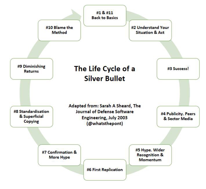
    The Lifecycle of a Silver Bullet. The paper summarises the 11 stages in the lifecycle of a silver bullet, from the perspective of a new method being introduced into a manufacturing company, but it could by any organisation. I’ve taken the liberty of translating the text into this graphic which I’ll explain below.

    img_7145

    • Stage #1 Back to Basics. This involves throwing out all of the existing silver bullets and having a good look at your organisation, because you really should know it better than people from outside.
    • Stage #2 Understand Your Situation & Act. The most important part. This involves a proper examination of what does and doesn’t work for the organisation. Done by the people who are involved in the actual work, not external consultants. Managers listen (properly) and help to make good things happen.
    • Stage #3 Success. The organisation reaps the rewards of having people working at the jobs they understand and are good at.
    • Stage #4 Publicity. Peers and Sector Media. People start to notice  good things happening and case studies and other reports start to emerge. I’m not against case studies, but beware. There is always a tendency to ‘re-imagine’ what happened in getting from A to B, so that it all neatly fits together and looks like there was glorious plan (Hindsight Bias).
    • Stage #5 Hype. Wider Recognition and Momentum. People really start to pay attention now and look at how they might copy some of what the original origination did. This really helps if the original approach is given a name (The Balle-Argentee Method) and a ‘model’ created that you can easily draw on office flipcharts.
    • Stage #6 First Replication. Things haven’t gone horribly wrong YET. The first people to replicate do a lot of work to understand why The Balle-Argetntee Method works. They probably talk closely with the people who originally used it, and modify the process to suit their own circumstances.
    • Stage #7 Confirmation and More Hype. The First Replicators have success in using the method. This confirmation is all that is needed for the sector media and other commentators to ‘cash in ‘ and produce literature promoting the method. This is where the management consultant and others get involved offering to help organisations implement the Balle-Argetntee Method. (Does any of this sound familiar yet?)
    • Stage #8 Standardisation and Superficial Copying. This is where things really start to go wrong. In a world of tight budgets, conflicting demands, initiative overload and dubious leadership, the people within organisations are forced to implement the Balle-Argentee Method. This will be fresh on the heels of the last improvement methodology that head office have sent down the line. Just to make things worse, it has been standardised and simplified by the Central Team so that anyone can understand it (this might get called ‘designing out the idiot’ in some organisations…)
    • Stage #9 Diminishing Returns. No surprised here.  Staff resist having something else forced upon them and The Balle-Argentee Method fails to solve the problems of the organisation.
    • Stage #10 Blame the Method. The Balle-Argentee method is discredited. This is backed up by evidence from front line delivery where staff complain that the method makes them do stupid things (this always helps in getting shot of something).
    • Stage #11 Start Afresh & Back to Basics. Someone sensible throws out the Balle-Argentee Method. They have a good look at their organisation, because they really should know it better than people from outside. And the whole cycle starts again, just like the Silver Boomerang mentioned at the start.

    Who should do what to dodge a Silver Bullet? The paper helpfully suggests actions for the following people:

    • EVERYONE – Remember that methods are just a means to an end.
    • EXECUTIVES – Understand your organisation, and also understand the methods you are promoting and listen to messages from below.
    • MANGERS – Really need to understand the methods they are pushing.
    • PROCESS / POLICY STAFF – Push back if things don’t look sensible, especially any targets imposed.

    Finally the big message here is to understand your own context and situation. Don’t rely upon ‘second generation silver bullets’, which are someone else’s solution.

    So, What’s the PONT?

    1. The desire for Silver Bullets is common and driven by many complex factors. Like Silver Boomerangs they keep coming around.
    2. If anyone does offer you a Silver Bullet, just say no. If something seems too good to be true, it probably is.
    3. One key to ‘dodging a silver bullet’ might be to make the best use of the ‘lead’ bullets you have already. However, this is hard to do and to quote Matt Wyatt from the previous post… this, “inconveniently requires insight into the context, longstanding relationships, and experience over time to work its way through.”
  • “There isn’t a Silver Bullet solution” is one of those phrases that gets used quite a lot, you might have heard someone use it during a lapse into ‘management speak’?

    Two things make me wonder about this; in many situations people actually want the ‘Silver Bullet’ and secondly, this is despite the fact they know that other silver bullets haven’t worked previously. Stick with me for a moment while I try and explain some of my thinking.

    Silver Bullets and the Lone Ranger.  The magical power of silver bullets (you can read about here) goes back to the mystical times of Grimm’s Fairy Tales, where silver bullets were the only things that could stop (kill) dangerous and terrible beings like werewolves. However, I prefer the use they were put to by the Lone Ranger (it’s kids telly of my youth thing).

    The Lone Ranger would ride into town and save people from the baddies without any wholesale killing and carnage. He used silver bullets in his gun as a symbol of justice, law and order. Very importantly, the expensive silver bullets were a reminder that life was precious and should not be thrown away. The point of the Lone Ranger not shooting to kill was that the law would ultimately provide justice.

    Just to crush my childhood memories, one thing ballistics science tells us is that silver bullets probably aren’t as lethal as conventional lead bullets, an important point to remember for later.  And we mustn’t forget Tonto, the Lone Ranger’s buddy. This modern video from Robot Chicken emphasises the high cost of using silver bullets with a profound observation from Tonto at the end.

    So what has the Lone Ranger got to do with Richard Pascale? Thanks to Matt (@ComplexWales) for opening my eyes to the work of Richard Pascale. This British Library, Management and Business Studies Portal article about Pascale’s work on; Change Management, Organisational Agility and Complexity is a good place to start reading.

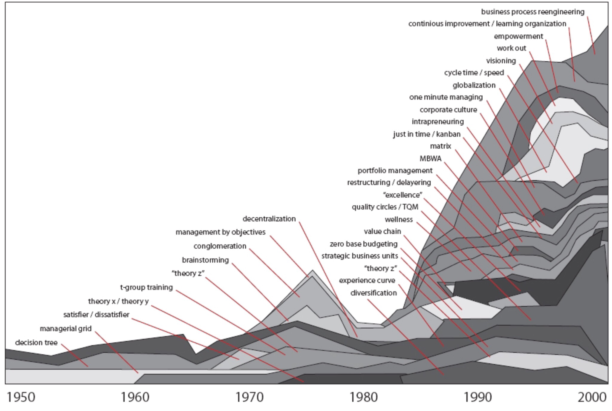
    One of the most well known pieces of work from Pascale is what he did to map out the ‘business fads’ that were being used in organisations. This looked at the period from 1950 up to 2000 and is illustrated in the graphic below.

    Richard Pascale Business Fads 1950-2000. From Managing on the Edge
    The vertical axis measures influence of each management theory (fad) and it is fairly self explanatory.

    In the space of 50 years the workplace has become overwhelmed with management theories on how to run a better organisation.

    Having discussed this with a few people it is quite sobering to add up the number of theories we recognise and how many we’ve been subjected to. What is even more worrying is the number where I was once a willing conspirator in implementing that particular fad…  Have a go yourself, there’s nothing to be ashamed of (……or maybe not).

    Silver Bullet Syndrome. This is the link between Pascale and the Lone Ranger. I am willing to bet that at some time each of these management theories will have been presented as a ‘Silver Bullet’, to solve the problems of the organisation.

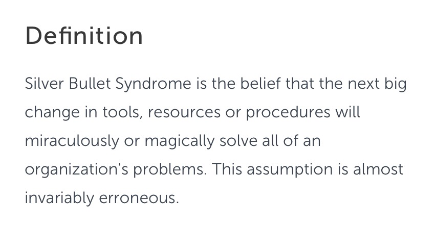
    Source: Techwalla, What is Silver Bullet Syndrome. Kevin O’Donahue
    I’m not sure if its an official syndrome, but Silver Bullet Syndrome has been described in by Kevin O’Donahue on the Techwalla site here. Definition attached.

    What I do know about Silver Bullet solutions is:

    • They do cost money and resources. Nothing is for free and they might even be very expensive, like the Lone Rangers silver bullets – therefore use them sparingly.
    • Sometimes they don’t work as well as standard lead bullets (I did say remember that one).

    Why do we have Business Fads and over use of Silver Bullets?  This is a tricky one to answer. I’m hoping that Matt (@ComplexWales) will ‘ride into town’ with some definitive evidence on the cognitive biases and psychology that explains this. In the meantime here are few suggestions from me:

    1. The need to be seen to be doing something different. A change in Managers/Leaders very often comes along with a new way of doing things. The new management fad could well be that ‘new paradigm’, even if the old way was perfectly good.
    2. Impatience. Sometimes things take a long time to work their way through from concept to impact. Some people will be impatient and will want to try something new rather than wait patiently.
    3. Not Invented Here Syndrome. This can often be associated with a change of Manager/Leader and is a need to have your favourite management theory rather than someone else’s.  It might be linked to Hubris?
    4. Over zealous Management Consultants, selling you expensive Silver Bullets you don’t need. Don’t under estimate the power of this one on what happens in organisations.

    So, What’s the PONT?

    1. There are literally dozens of management and business theories that have developed since 1950. Just be aware of what’s on offer, and where it sits alongside other theories.
    2. A ‘Silver Bullet’ can be significantly more expensive that a standard lead bullet. It’s worth thinking about all of the costs associated with a promising new idea.
    3. Be more like the Lone Ranger, he rarely used his Silver Bullets, only when they were really needed.
  • At last, I get to use one of my holiday pictures (Iceland 2016)

    How can a noxious substance like dog poo move between multiple uses in society?

    • a manufacturing process ‘raw’ material sought after by humans, 
    • a public nuisance leading to enforcement and prosecution, and 
    • a new opportunity to light the streets and improve communication?

    To put some context around my sudden interest in dog poo, it’s featured quite a lot in my life this week:

    • It’s something I have to deal with as a responsible dog walker. Just remember to bin the offending package before you get home, and not leave it in your coat pocket when you hang it over the warm radiator (yep, I’ve done that…24 hours later it stinks!).
    • A friend of mine was accosted at 6.30am by Council Enforcement Officers while he was walking his dog through the park. He didn’t mind that too much, he’s a responsible citizen. What he did find irritating was being asked to turn out his pockets to prove he had poop bags. Apparently a lack of sufficient poop bags is indication of intent to commit the crime of not picking up your dog poo.
    • Another friend is standing for public office (in a Council). One of their manifesto promises is to tackle the (perceived) dog poo problem in the town. Dog Poo a big issue for the local voters. Yes, it really is, but it wasn’t always so…

    London Dog Poo, ‘Pure’ and Useful. There was a time when Londoners (well, some of them) would scour the streets of the Capital looking for valuable dog poo. The poo was taken to Bermondsey, the leather tanning district, where tanners paid good money for the smelly cargo. More detail about the Bermondsey Poopmongers in this Londonist article: A Brief History of London Poo.

    Apparently some Tanners would agitate the soaking pits with their feet. Nice!

    The poo was used in the leather tanning process. This involved either ‘drenching’ (soaking)  animal hides in a liquor of dog dung and water or ‘masterings’ where a ‘confit’ of dog dung and vegetable matter was laid (by hand) onto the animal hide. Lovely!

    The words pure, puer or pewer were used to describe the dog poo. If you haven’t gone a bit queasy and want to know more about the use of ‘pure’, there is a fascinating article written by Julian Walker, ‘More poo, and some words from tanning’.

    As a consequence of the demand for dog poo in tanning, it meant that the streets of towns with tanneries were kept free from the nuisance, hurrah! Unfortunately the perfectly natural dog poo became replaced by more efficient chemicals during the industrial revolution (chromium compounds). Since then, with the increase in the population of people (and dogs) the nuisance has returned to the street. From Hero to Zero.

    One quick thought, I wonder if any of the Artisan Hipsters of Bermondsey (and other hipster enclaves) would consider a return to the old ways of leather tanning? It might help to keep the streets clean?

    The Menace on the Streets. Since the decline of using ‘pure’ dog poo in leather tanning it has been a significant problem on the streets of cites, towns and villages across the globe.

    This article from OnEarth Magazine, The Poop Problem summaries the scale of the problem:

    • America has 83 Million pet dogs,
    • They produce 10.6 million tons of poo every year,
    • One gram of dog poo contains 23 million bacteria,
    • Studies have attributed 20-30% of the bacteria in urban watersheds to dog waste,
    • Air samples in Cleveland and Detroit contain bacteria that is 10-50% from dog waste.
    • I won’t go on…. Total Zero.

    Bright Lights and Wi-Fi, Moving back from Zero to Hero. This is quite interesting if you are into the science behind behaviour change.

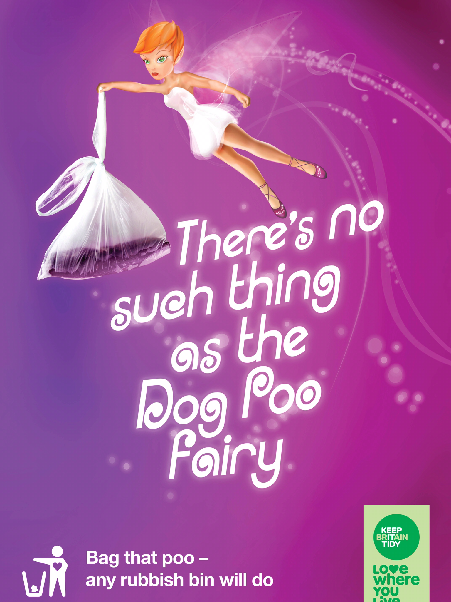
    Things like the Keep Britain Tidy poster above, ‘There’s no such thing as the dog poo fairy’ are examples of campaigns designed to educate and appeal to people’s better nature. Other ‘campaigns’ involve shaming techniques, like painting poo fluorescent yellow, or sending it back to the dog owner in a gift wrapped box. You can have a read of some of the best examples in this article on Pet Poo Skiddo, 10 Bizarre Campaigns Pushing People to Pick Up Dog Poop.

    Three things stick out on the ’10 Bizarre Campaigns’ list that aren’t focussed on education or punishment. These seem to offer incentives as a method of changing people’s behaviour:

    1. Pick up your Dog Poop and get a Lottery Ticket in return. An interesting idea, but it does remind me of the Cobra Effect (link here), where there the solution actually made the problem worse.
    2. Put your dog poo into some sort of ‘digester’ that creates methane gas, that powers something that generates electricity, possibly a bright light. I’m not sure that these digesters are very effective at small scale, but you can have a look at the idea in Fast Company Magazine, ‘Don’t Throw Our Your Dog’s Poop: It’s Now a Valuable Resource’.
    3. Offer people free wifi in public places if they deposit their dog poo in a special collection bin. The more poo that gets deposited, the longer the WiFi lasts. There is a lovely example from Mexico City where an internet company, Terra have installed these facilities in 10 parks across the City. You can read more here in this New Atlas article, ‘Mexican internet company exchanges public Wi-Fi for dog poo’, not a headline you see every day… Alternatively you can watch the video, there is a particularly hilarious bit at 1 minute 26 seconds with a dog owner massaging his dogs stomach to produce the ‘goods’ that will allow him to send an email. Enjoy!

    http://www.youtube.com/watch?v=d8_KNPKWmsA

    So, What’s the PONT?

    1. Problems aren’t always problems, sometimes they can be solutions to someone else’s problem. Things change and you need to be aware of opportunities.
    2. Incentives and things that make people’s lives easier might be more effective at changing behaviour than just a threat of punishment or educational posters.
    3. Free WiFi might be the answer to all of life’s problems. If you don’t believe me have a look at this post about the use of Free WiFi to reduce the risk of skin cancer in Peru.


    The source of the WiFi transmitter intrigues me


  • We should do more with cardboard
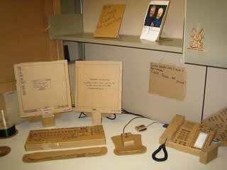
    This post isn’t as weird as the title suggests, so please stick with me. It does however sit in the ‘curious things you learn when you are walking the dog’ folder. The reason for the cardboard office picture will be explained shortly, I promise.

    Baugespann, Bauprofile and Aussteckung.  These are all lovely words from the world of Swiss Building Construction Regulation. The basic idea is that before you get to build anything permanent, you have to put a life size profile of the proposed building on the site, for a month.

    This is typically an arrangement of vertical posts and angle pieces that allows neighbours or anyone else who might be affected by the building to ‘experience’ what it might actually look like. The idea is that if you are concerned by the proposals you can then make representation to the planning authorities.

    For anyone who wants translation of the German:

    • Baugespann – Construction Span
    • Bauprofile – Building Profile
    • Austeckung – Outline

    If you are really interested you can read some more on Swiss Planning Regulations here , look at this Guardian article; ‘Ghost Buildings to help public envisage impact of developments’ or enjoy this video from (very neat and efficient) Swiss Construction Bauvisier.

    Clever Job Creation or Something Better?  After watching a few of these Swiss construction company videos I did start wondering if the whole Baugespanne idea was some sort of clever job creation scheme dreamt up by engineers? Anyway, putting my scepticism aside, I can see some real benefits from putting up a life-size profile of a building before permission is given.

    Firstly. It really does give you a sense of impact. All the drawings in the world, cardboard models and augmented reality building ‘fly throughs’ don’t quite do that. There’s a lot you can ‘smooth over’ in an architect’s drawing.

    Secondly. It gets over the hassle of trying to unearth the plans from your local planning department. This is a bit of an issue for me which I wrote about ages ago in: Beware of the Leopard, Vogon Planning Revisited.

    Travelling to and navigating the planning department can be very difficult and intimidating for lots of people. Having the developers take on the ‘burden’ of actually showing you what they plan to do, takes away some of that hassle. It might even impact upon their behaviour and get them to think more carefully about the impact of their plans. 

    Back to the Cardboard Office: I promised this would be explained. Here goes. 

    I do wonder if there is an opportunity to extend the Baugespann concept into public service design? There is a lot of talk of ‘prototyping’ in public services at the moment, but I don’t see a huge number of examples I would recognise as a prototype.

    The cardboard office is an example of a prototype that came from an post I wrote a while back. It emerged after a visit to a manufacturing company and you can read here about how they literally built a manufacturing process out of cardboard to test it.

    There are some stand out examples of organisations like Bromford Lab who take the process of testing and prototyping ideas seriously. On a visit to them I got to sit in an actual bus seat, where they were testing the user experience of what it would be like to access their services on a mobile phone, on the bus. The set up didn’t cost a fortune, and it put you firmly in the shoes (and bus seat) of the service user.

    Apparently there is a suite of rooms somewhere in Swansea University that can be set up to simulate ‘real life’ and the DVLA have a Usability Testing suite which you can read about here. However, the routine testing of concepts at an early stage, using things like life-size cardboard models isn’t something I bump into every day. At the risk sounding slightly obsessed with making things out of cardboard, it think it would be a good thing to try.

    Finally: The Baugespann concept was introduced to me by a neighbour.

    I was out walking the dog and he asked me “how is the house building work next door going?” An explanation of Swiss Planning Regulations followed, it’s that sort of neighbourhood.  Unfortunately the dog got bored after 10 minutes and I was dragged off into the woods before he could share the full details (I love that dog).

    Next door, they haven’t quite gone for the aluminium/wooden poles and profiles, but this steel frame does give a fair impression of what they have planned.

    So, What’s the PONT?

    1. The Baugespann approach does mean that the people who will be affected by the change (constructing a building) get a real opportunity to experience the likely impact. I’m not sure this sort of rigorous approach is applied to most public service changes.
    2. The process of constructing a bauprofile (building profile) is likely to have an impact on the behaviour of the people designing that building. They have to ‘live’ with the design and might be a bit more thoughtful in what they design. Would there be any change in behaviour if you had to ‘construct a life size model’ of your new service?
    3. There are some examples of people like Bromford Lab taking the ides of testing and prototyping ideas for new types of public services seriously, but it’s not as common as Baugespann.
  • Yes, they are sitting on beanbags...
    Yes, they are sitting on beanbags… cartoon by Tom Fishburne

    Stick with me for a minute and I’ll explain the Fleas in a Jar Experiment. In the meanwhile how about some Idea Antibodies…?

    Organisation Immune Systems. The concept of organisations having ‘Idea Antibodies’ has been around for a while, and is nicely explained in this post ‘I am a virus, My name is Innovation’ by Graham Brown-Martin (thanks to Marcus Guest for sharing it). I was first introduced to it by Dave Snowden and wrote about it here back in 2012.

    The basic idea is that an organisation will have an ‘immune system’ that protects ‘the body’ from bad things that might do it harm. Antibodies will be attracted to the ‘bad thing’ and attack it to limit any damage it will cause. This is an automatic process that happens without the organisation thinking or doing anything purposefully to make it happen.

    Unfortunately new ideas in an organisation can be seen as a ‘threat’ which stimulates an attack response from the ‘Idea Antibodies’ of the immune system. I’m sure you get the idea.

    This might feel like a bit of a daft idea, but ponder on this question for a moment. Have you ever had (or seen) a brilliant idea go nowhere, or get killed off in an organisation for no obvious reason? ‘Death by a thousand committee papers’, ‘HR issues’, ‘procurement rules’, ‘indifferent managers’ or the dreaded ‘ethics committee’? Maybe these (and a few other things) are all part of the immune system response?

    Why are New Ideas a Threat? This is a complicated question to answer. Graham Brown-Martin in his post suggests there are commonly 13 things that contribute, I’ve listed them below (with my own commentary):

    • Fear (fear of speaking out, fear of failure?)
    • Hierarchy (only the bosses can possibly have good ideas?)
    • Focus on short-term results (an obsession with meeting narrow targets?)
    • Risk of cannibalising (damaging) the existing business (the status quo dominates?)
    • Over reliance on data (not sense checking and using human judgement?)
    • Lack of purpose beyond profit (substitute profit for targets in public services?)
    • Lack of autonomy (part of the Hierarchy issue?)
    • Lack of a process to nurture ideas (see Fleas in the Jar Experiment)
    • Working in silos (hinders exchange of ideas?)
    • Micromanagement (linked to a lack of autonomy?)
    • Fixed and narrow job descriptions (linked to autonomy & hierarchy?)
    • Employee disengagement (see Fleas in the Jar Experiment)
    img_6583

    You could boil this down to a basic human instinct and I really like this quote from Aldous Huxley.

    “The vast majority of human beings dislike and even actually dread all notions with which they are not familiar…Hence it comes about that at their first appearance innovators have generally been persecuted and derided as fools and madmen”

    Basically we don’t like things that are new / different / unfamiliar are will do our best to avoid them.

    If you scale this behaviour from the individual up to the organisational level, you can see how it might appear as an immune system, with idea antibodies. The part of the quote that describes how innovation and people (the innovators) are often treated badly in organisations (and by wider society) is particularly relevant to the concept of immune systems and idea antibodies.

    So what’s this got to do with Fleas and Jars? You might have found yourself in a situation where you have been invited to an organisational brainstorming session, hackathon, unconference or even a ‘skunk camp’.

    I love that idea that an organisation wants to do something different, and get new ideas surfaced. I really do.

    However, it’s often not that easy. Remember that list of 13 things that contribute to an organisational immune system?  What if you’ve spent your corporate life working in that environment for a number of years? There’s a fair chance that your behaviour will have been altered to respond to the environment. You might even have your own immune response to prevent getting hurt – not sticking your head above the parapet – and you might not even recognise it.

    A while ago Andy Middleton summed this up for me as follows: “it’s like the fleas in the jar experiment. You stick some fleas in a jar, and leave the lid on for a while. When you take the lid off the fleas have learnt they cannot jump higher than the lid. Even when the lid is removed they never jump higher than the height of lid and escape the jar”

    It’s powerful metaphor. There is a video that explains the process, with some convincing lab coats and scientific equipment in the background (and a suitably ‘serious scientist’ narrator). I’m not sure about some of the actual science behind the experiment, but it does make the point and raises a few questions:

    • If you are asking people who have been in the organisation for a long time to ‘think out of the box’ (or jar) it might be harder for them than you think.
    • If you are a ‘flea in the jar’, how do you know? You might be able to jump higher than you think.
    • How do you help people think outside the box / jump higher than they think they can?

    Here is the Fleas in the Jar Experiment, enjoy the metaphor.

    How to become a better flea? I’ve not much advice on this at the moment. The best I can suggest is go looking for another dog, cat or hedgehog to live on for a while. By experiencing how other fleas live you might get an idea of where your jar sits, and how to jump out should anyone decide to ‘remove the lid’ and invite you to a corporate brainstorming session.

    Obviously (or possibly not) I’m talking about things like working for other organisations or secondments here. Probably best not to talk fleas and hedgehogs when you are discussing your secondment ideas with the HR department…

    So, what’s the PONT?

    1. Organisations can have immune systems and idea antibodies. It’s not personal. It’s just an automatic survival mechanism.
    2. Be aware that you might have become a flea in the jar.
    3. One way to test if you have become a flea in the jar is to try out other dogs, cats and hedgehogs. It might help if the lid gets taken off your jar.
  • Hello Chuck, I’m Pepper, can I help you find a book? My pic.
    Designing out the idiot. Very many years ago I had a job to create a system to collect information from staff working out in the fields (literally, they did work in fields). My boss at that time instructed me to create something that ‘designed out the idiot’. Basically something that nobody could get wrong, accidentally or deliberately.

    Being enthusiastic and eager to please I approached the task with ‘ruthless efficiency’, another one of the Boss’s favourite sayings. Unfortunately there was only one real idiot in this story, me!

    My colleagues who worked out in the fields were highly experienced and skilful individuals, committed to their jobs. Designing a ‘system’ that essentially treated these people like idiots was never going to work, and was ultimately a deeply disrespectful thing to do.

    Fortunately my actions were largely harmless, as is the case with much of my administrative effort I suspect. However I did get reprimanded for my ‘ruthless efficiency’. That happened 25 years later, when I met one of the subjects of my system at a retirement party. 25 years on and he was still irritated!

    Perfect Systems. The title of this post quotes from the 1934 T.S.Eliot poem, Choruses from “The Rock”. You’ll find it in Chorus Six, which has been interpreted as being about why the modern world doesn’t understand it’s past and tries to deny it. In the link above I do like the comment that the poem… “captures the struggling, empty soul of modern work life”…. and that was 1934! Anyway here is the quote:

    img_6403-1I haven’t dabbled in poetry appreciation since I was in school, and I’m not about to start again. However, those few lines from Choruses from “The Rock” are useful for interpreting what I was trying to achieve with my ‘design out the idiot’ endeavours. In my naive way I was aiming for a ‘perfect system’ that removed the need for anyone involved to be consciously ‘good’. The ‘right’ thing would happen, without anyone having to think about it.

    Unfortunately I suspect my ‘designing out the idiot’ mindset will have biased the process. This was to a point where my system was a heavy-handed tool of checking and compliance, rather than something that was helpful for the people out in the field as well us sitting in the warm and comfortable head office.

    Deviant Librarians and Perfect Systems. Choruses from “The Rock” was written in 1934 but seems to have a great deal of relevance to current predictions that the world of work is moving rapidly towards large-scale automation and ‘perfect systems’. Last week this intrigued me: ‘Automated book-culling software drives librarians to create fake patrons to ‘check-out’ endangered titles’

    Basically it is the story of two librarians at East Lake County Library in Central Florida who engaged in deviant behaviour, by creating a fictitious person (Chuck Finley). The purpose of fictitious Chuck was to borrow books, so that they would appear to be ‘popular’ on the computerised system. This would avoid them being ‘culled’ by the software algorithm that decided what books would sit on the library shelves (a perfect, human free, system). The librarians knew from their experience, relationships and understanding of their service users that some of the books at risk would come back into fashion. They used ‘Chuck’ to help keep them on the shelves.

    Unfortunately their deviant behaviour was ‘rumbled’. They did what they did for the right reasons. However creating a fake identity probably isn’t really something that public servants should indulge in outside of a James Bond movie.

    I don’t know much about how the East Lake Library book culling software and algorithm was designed. Perhaps there was plenty of ‘user experience’ testing to understand the point of view of highly experienced librarians? Hopefully the coders and designers spend time in the libraries observing real life and speaking with the librarians and the lenders to understand the needs, wants and behaviours of both groups? There may even have been and extensive process of piloting and refinements of the system to reflect feedback from the real world experiences?

    Whatever approach they used, I do hope it wasn’t anywhere close to the ‘design out the idiot’ brief I was given over 25 years ago. With the growing push to automate so many systems there is a lot at stake. Systems that focus initially on supporting humans, might be a better option than jumping straight to ‘perfect systems where nobody need be good?’

    Artificial Intelligence or Artificial Stupidity? One final thing to ponder. Whilst the story of the deviant librarians was getting an airing last week, Matt Wyatt (@ComplexWales) made the following comment to Ollie Minton (@drol007) (both good Twitter buddies), “Just remember, way before Artificial Intelligence turns up we’ll spend a long time living with Artificial Stupidity!”

    img_6515So, What’s the PONT?

    1. Automated systems can, and have proven to be, a great help to everyday human activities.
    2. The mindset that influences the design of the system is essential. I’d suggest not adopting a ‘design out the idiot’ view of people.
    3. Think about augmentation (complementing what already exists) rather than complete replacement. To quote Matt, you might spend too much time with Artificial Stupidity before you get to Artificial Intelligence, so just be aware of the consequences.
  • Seriously, what cat would wear that colour? Seriously, what cat would wear that colour? Image Source: Thai Flood Hacks https://thai-flood-hacks.tumblr.com/post/12826178385/water-bottle-swimming-vest-for-cats-via#notes

    Everything is wrong with this picture. There is no cat I’ve ever known that would permit me (or anyone else) to:

    1. Put a vest on it,
    2. Sew plastic water-bottles into the vest, and
    3. Sit around to have its picture taken wearing the offending garment (it does have it’s back to the camera though).

    Thai Flood Hacks. To be fair to the cat these were unusual circumstances and this may have been a concession until normal ‘cat like’ behaviour could be resumed.

    The floods that inundated Thailand in 2011 were a disaster that caused death, suffering and huge economic damage. In response to extreme circumstances people will often do extraordinary things to save lives or make everyday living a little bit easier. Necessity, frequently is, the Mother of Invention.

    To help share the knowledge about some of the clever solutions that people created a site called Thai Flood Hacks sprang up in 2011 (link here). Basically people ‘hacked’ what they had available and used it for variety of purposes to alleviate the dangers posed by the rising flood waters. The ‘hacks’ covered a numbers of areas including:

    • protecting life (plastic bottle vests for cats and dogs)
    • protecting property (huge plastic bags for cars) and
    • getting about in the flood water (modified vehicles and plastic bottle boats).

    Two things stand out for me on the site; just how much you can do with a plastic bottle and, the emergence of exaptation.

    What is Exaptation? The most basic explanation of exaptation (I understand) is: something that has been created for a specific purpose, is picked up and is used for a completely different purpose.

    The idea originates in biology and was first introduced to me by Dave Snowden who has written about it here in Exaptation and Serendipity Part 1. Examples from biology include the idea that feathers were originally developed as a cooling mechanism, before being exapted for the purpose of flight.

    Another good example is the electromagnetic radiation that ‘leaked’ from early radar equipment, melted the chocolate bar in Engineer Percy Spencer’s pocket, and was eventually exapted into the microwave oven. You can see the full story in the video below.

    When you look at the Thai Flood hacks site you can see some very clear examples of exaptation, things successfully used for purposes they were never intended for. It’s not all imaginative uses of plastic bottles. Protecting your car from the floodwaters by driving it into the large plastic bag your sofa was delivered in is genius.

    You can do anything with a plastic bottle. I’ve got to talk about plastic drinks bottles for a moment. If you have looked at the Thai Flood Hacks site you will see they feature a lot. I suppose that once you’ve made the link between the need to stay afloat and the abundance of plastic containers that hold air, there is no end of uses you can put them to.

    The fun with plastic bottles doesn’t end there though. I’ve been browsing the internet for ‘interesting / alternative uses for plastic bottles’. There are absolutely dozens of things you can do with a plastic bottle and a little imagination. Have a look at this article on life hack.org; 30 Ways to Upcycle Plastic Bottles, lots of alternative uses, but are they really exaptation?

    img_6296Difficult to tell if Pugsley approves, or not. Image Source: https://thai-flood-hacks.tumblr.com/post/12872548758/my-parents-dog-cant-swim-so-we-made-this#notes

    The Trouble With Exaptation. The problem with exaptation is that it is incredibly difficult to plan for. How do you know that electromagnetic radiation is going to be useful for warming your lunch?

    How do you make that leap between having a drink of water and tying the empty bottles onto the side of your dog?

    A lot of exaptation comes down to about four things as far as I can understand; deep curiosity, wide diversity, the willingness to experiment and acceptance of mess and failure:

    • Deep Curiosity. Continually asking the question why and looking for new answers might just lead you to the answer you never thought of.
    • Wide Diversity. The more sand you sift the more likely you are to find a diamond.
    • Experimentation. When you spot an opportunity, test to see if it might work.
    • Accepting the Mess. This is unlikely to be a process where everything goes to plan and often fails.

    I spoke about this challenge at the All Wales Continuous Improvement Community recently where I offered a few suggestions around how you might ‘normalise innovation’ and have a better chance of spotting exapation opportunities. These included:

    In addition there is some work happening at the Cynefin Centre in Bangor University to put some structure around the area which has been called; Managing for Emergence or Managing for Serendipity. More of that in future posts, but this slideshare from Marc Rettig on Managing Emergence gives a good idea of some of the challenges.

    So, What’s the PONT?

    1. Necessity can be the Mother of Invention. Extreme situations can lead to some incredible innovations and exaptation.
    2. Exaptation is difficult to ‘manage’. How do you plan for the unknown? Is it possible to create an environment where exaptation flourishes?
    3. Activities like hackathons and crowdsourcing can create the environment where ideas flow and there is opportunity for expatiation to emerge. The trick is recognising it.

    I have written about exaptation previously in this post: Expatiation, Innovation, Adaptation, Continuous Improvement and Hyperbole. It’s dictionary time

  • Sophistication 1980's style. Is that pampas grass in the garden?
    Sophistication 1980’s style. Is that pampas grass in the garden?

    Buried deeply in the recesses of our kitchen cupboards is a Le Creuset Cast Iron, Lifetime Guarantee, Fondue Set (somewhere near the automatic bread maker and the juice making thing). It was a wedding present and represented the height of 1980’s sophistication… apparently.

    It’s never been used as far as I can remember. All that boiling hot cheese dripping on you best chunky knit jumper, whist engaged in ‘polite conversation’, wasn’t really our scene. The fondue (and other useless kitchen equipment) nostalgia will hopefully make sense in a minute.

    Swiss Cheese and Failure. Previously I’ve written about the James Reason Swiss Cheese Model which is widely used to illustrate how failure happens in complex systems. I’ve even had a go at trying to explain it in 300 seconds (link here).

    I really like the Swiss Cheese Model (SCM), but it does feel a bit uncomfortable around the idea that successive ‘layers’ in a complex system are fixed and rigid. Everything I’ve experienced tells me that human systems are far more fluid as they change and respond to the circumstances.

    Secondly, I never really worked out how you could extract learning from an incident using the SCM. It always seemed that the learning was drawn out as part of a post incident review. From practical experience, I would prefer to extract learning and make adjustments as you go along, rather wait for a ‘project post mortem’.

    The James Reason Swiss Cheese Model Source: Li & Thimbleby, paper
    The James Reason Swiss Cheese Model
    Source: Li & Thimbleby, paper

    The Hot Cheese Model of Failure. This is a lovely paper by Karen Li and Harold Thimbleby from Swansea University, published in The journal of the Royal College of Physicians of Edinburgh, June 2014,  Hot Cheese: A processed Swiss Cheese Model.

    The paper does a great job of building on the James Reason SCM of failure and answering the questions I had about the flexible nature of the ‘layers’ and how you extract learning from failure.

    Briefly what I took from the paper:

    • Some of the ‘defensive’ layers introduced in a complex system to prevent failure, actually lead to more failure. This is due to the unpredictable nature of a complex system. There are some startling examples in the paper to illustrate this; from nuclear power plants to the administrative controls around prescribing medicines.
    • The ‘layers’ in a complex system described by the SCM are actually very flexible and can be usefully described as ‘hot cheese’. The layers change shape, with ‘holes’ appearing and bits of melted cheese dripping onto the layer below. This gives us the Hot Cheese Model (HCM) description.
    • In many organisations the reporting of failure, incidents and near misses though ‘theoretically promising’ is often inaccurate and ineffective. ‘Unremarkable errors’ rarely get reported and overall the reporting of incidents and failure is very far from 100%. They reference a number of studies which have demonstrated this.
    • The ‘Fondue Pot’ is where the Hot Cheese ends up. This is the point were a lot of the learning from incidents typically takes place in many organisations – The Post Incident/Project Review.
    • I’ve been involved in numerous post project learning events and incident reviews and the ‘Fondue Pot’ describes it perfectly. A gloopy blend of everything than has happened beforehand, all mixed together in the pot. The trouble is that most of the time you cannot distinguish anything specific, just ‘general lessons’.
    • This seems like a good point to link to the description and history of the Cheese Fondue

    Learning from Failure, Rubbery Cheese and the Fondue Pot. The paper introduces a final idea a round the concept of ‘rubbery cheese’. Basically this is about identifying failure and learning from it well before you get to the gloopy ‘Fondue Pot’ of the post incident review.

    Each successive ‘layer’ in the system needs to be ‘rubbery’ so that less serious incidents, failures, learning points etc are ‘bounced’ out to a place were you can learn from them.

    img_6265Figure 4 from the paper gives a useful indication of how this might work, which they describe as:

    “To improve things, we need mechanisms that enable data capturing and monitoring within every system defence layer, so ‘unremarkable errors’ and near misses, along with the gradual development of an incident and its contributing factors, can be made tangible. In other words, we need our hot cheese to be rubbery, so forces and drips that didn’t made it through a defence can be bounced into the recording system as well, instead of disappearing without a trace.” (Figure 4)

    Reading this I had Dave Snowden ringing in my ears. This sounds very much like the description of a process for the continuous capture of narrative into SenseMaker...

    So What’s the PONT?

    1. Post project reviews can be a bit of a Fondue Pot. A gloopy mixture of learning points where the best you can expect are ‘generalised lessons’.
    2. To extract more meaningful ‘learning from failure’ it is better to have a system of continuous capture and sharing throughout the process, and learn as you go along.
    3. The Swiss Cheese and Hot Cheese Models provide a useful concept to start talking about failure, and the processes by which you might most usefully learn from it.
  • Why don’t more people cycle? Here’s a small experiment you can try. Introduce ‘what can we do to encourage cycling to work’ into a conversation. Wait and see how long it takes before someone mentions, ‘The Dutch’. Less than 5 mins I’d wager.

    Depending on which bit of the internet you believe, 25% of all trips to work in the Netherlands happen by bike. This compares to less than 3% in the UK. There are ‘mountains’ of material explaining cycle use in the Netherlands, and it’s not just because of the lack of mountains (and hills). Cycling is a ‘social practice’. “We aren’t cyclists, we’re just Dutch” is a typical comment, which this BBC article explains in, ‘Why is cycling so popular in the Netherlands?’

    Social Practice Theory and Behaviour Change. Here’s a quick reminder (my interpretation) of some of the science behind Social Practice Theory (I covered this in my last post: ‘Social Practice Theory, Tube Chat and relevance to Behaviour Change’.)

    • Social practices are the behaviours that define a group of people.
    • This is what that the group does, but also what it believes and understands about the world.
    • Some of the social practice is obvious and easily observed from outside, and some more subtle, like what things mean and unwritten rules.
    • Most human behaviour is influenced by social practices.
    • This influence is part of our automatic response, we don’t think about what, or why we are doing something, we just do it, as part of the ‘social practice’.
    • I used the example of not talking on the London Tube to illustrate this (see previous post).
    • From the behaviour change perspective – the Social Practice Theory argues that you focus on understanding and changing the social practice – rather than the individual person.
    • From a policy perspective (and value for money), changing behaviour through changing social practices can have an impact with a much wider group of people.
    • Focussing on changing social practices rather than just individuals changing their behaviour is quite a big deal.

    A bit more Social Practice Theory: Professor Elizabeth Shove who’s done a lot of work in this area divides the things that contribute to social practice into three ares; Materials, Know How and Meaning.

    • Materials. These are the physical things needed for a social practice.
    • Know How. The skills and competency needed to perform actions that fit with the social practice.
    • Meaning. The understanding of what it means to perform that social practice.

    I’ve seen this neatly wrapped up in the description of driving a car (as well as other things like having breakfast):

    • Materials: The car, the road infrastructure etc
    • Know How: passing your driving test, knowing the highway code etc
    • Meaning: the unwritten rules of the road like when to reverse when you meet another car on a single track country lane, and the say thank you with a wave.

    Key Point: If you want to change the social practice (and the behaviour of the people influenced by it) you need to change the component parts and the links between them.

    You can read more about this in Chapter 12 of Beyond Behaviour Change, edited by Professor Fiona Spotswood. The Chapter is written by Daniel Welch from the University of Manchester and uses a lot of material developed in the field of sustainable consumption (it’s worth reading).

    Cycle to Work Schemes and the MAMIL’s I was discussing social practice theory with a friend when she helpfully pointed out that the cycle to work scheme at their office was never going to work (on a large-scale). This was because of the MAMIL’s and meaning.

    The MAMIL’s (Middle Aged Men in Lycra) in the office had assumed responsibility for cycling and were ‘encouraging’ everyone else to be part of the ‘cycling revolution’. In her words, “if they think I’m going to join in with a bunch of sweaty blokes in skin-tight leggings, they can forget it”. The social practice of cycling within that office had a meaning that was associated with being a MAMIL. The organisation was going to struggle with increasing participation, despite the;

    • Buy a bike cheaply through the cycle to work scheme (economic incentive),
    • New showers (materials to support cycling),
    • Well lit bike racks (more materials)
    • A refresher course on Cycling Safety (skills development) and
    • A publicity campaign from the Comms Team (some social marketing),

    There was no way my friend was going to engage in a pastime where the social practice had an alien meaning.

    Linked back to the ideas around how you change social practice I have tried to capture some of the discussion we had about how you might change the social practice of cycling in that organisation. It’s in the diagram below and covers a range of activities that focus on social practice, not the individuals (it’s not perfect by a long way, just an illustration).

    img_6240
    My image. Adapted from the work of Elizabeth Shove et al

    Back to ‘The Dutch’. I think the BBC article (above) gives a good insight of cycling in the Netherlands; being a ‘social practice’. It is a picture of complex social practice that is driven by: Materials, Know How and Meaning. From what I’ve seen, in many cases people try to effect behaviour change by copying part of what they see has worked elsewhere and applying it locally. It doesn’t really work like that.

    Having financial incentives to buy a bike and having a publicity push isn’t going to create a ‘Dutch Cycling Culture’ in your organisation, if the ‘meaning’ associated with it alienates 97% of the workforce, sorry MAMIL’s.  (This post is partly a confessional to being a one time wanna be MAMIL….. but I’m over it now).

    And back to the Valley’s -1950’s style. There is also something in reminding ourselves our past. Talking to my Mother about riding a; single gear, (heavy) steel framed bike between Nelson, Ystrad Mynach and Treforest Trading Estate in the 1950’s /60’s is making me feel bad. Do I really need 28 gears and lightweight carbon-fiber frame before I even think about cycling to work? No I don’t! It was my Mam’s social practice before she’d even thought about me.

    So, What’s the PONT?

    1. Most of our behaviour (what we do) is influenced by the social practice of the group around us (an automatic response that we don’t think about).
    2. Social Practice Theory is about changing behaviour through changing the social practice, not focussing on the behaviour of individuals.
    3. If you can change the social practice of a group, you can have a much wider impact.

    Footnote: I probably should have read this paper before I wrote this post. From Professor Fiona Spotswood et al, Analysing cycling as a social practice: An empirical grounding for behaviour change.  Everything you need to know about cycling and social practice theory is here.

    PS. My Mother learned to cycle on this bike. Borrowed from Granny Tucker, who was in her 80’s and used to ride to the farm to milk the cows every day.
  • Established Social Practice
    Well Established Social Practice

    Did you ever receive ‘guidance’ from a parent, teacher or someone ‘older and wiser’; advising you to be careful about hanging around with a new group of friends (the wrong crowd)?

    Turns out they might have been right, and they knew something about Social Practice Theory.

    Underpinning the theory is the way that we think about things and make decisions. Broadly this happens in two ways;

    • Reflective: a relatively slow and rational process where we ‘think things through’ and consider the consequences of our actions, and
    • Automatic: a rapid and mostly unconscious process where we choose the quickest answer (not necessarily the best), without thinking too deeply.

    Influence from your Social Group. Part of Social Practice Theory is about the influence that the behaviour of a group of people (their social practice) has upon the behaviour of individuals.

    Within a social group there will be things that define that group that will often be obvious when seen from outside. For example the ‘social practices’ in a group of teenagers from Wembley (North West London) will be distinctly different to a group from rural Mid Wales. The clothes they wear, the music they like, how they walk up the street and even things like attitudes to authority will be different. It will all be wrapped up in the language they use and the stories they tell each other.

    Key to Social Practice Theory is the idea behaviour within the group is unconscious, something group members do automatically. Conforming with the ‘rules’, is performed unconsciously. We can choose to behave differently (reflective thinking), but it’s not that easy. Some social practices can have powerful influence on individual and group behaviours. I’ve previously touched on this idea in the Monkeys, Bananas and Complying with Daft Rules post.

    img_6212-1London Tube Chat – Disrupting Social Practice. As it happens I was in Wembley last weekend. Travelling on the underground from Paddington Station I was keen to spot someone wearing a ‘Tube Chat’ badge. Basically an invitation to engage in conversation with a complete stranger on the underground – introduced by an American (I’ll say no more).

    Apparently this has horrified many Londoners and has generated a backlash of ‘alternative’ Tube Chat badges you can read about in this London Evening Standard article.

    It is however a great example of someone trying to disrupt a very well established social practice of NOT speaking to strangers (or anyone else) on the London Underground. I didn’t spot anyone with a ‘Tube Chat’ badge, and was perfectly compliant with the social practice of ‘No Chat’ on my trip. I’ve been there enough times to know the rules.

    However, once back on the train to Cardiff I adopted a different set of social practices. This generally happens once you’ve passed Reading. The noise level increases, and you can have a lovely chat with those people from Nantymoel. Tidy! (I think they were related to my mate Colin from Ogmore Vale). Key point, I didn’t think very much about my different behaviours on the trains, I just did it, automatically.

    What has this got to do with Behaviour Change? Social Practice Theory has a lot to do with Behaviour Change which you can read about in the book Beyond Behaviour Change edited by Professor Fiona Spotswood. A few of the key points I’ve picked up so far:

    • Much of the behaviour change activity carried out by governments (and other agencies) focusses upon changing the behaviour of the individual,
    • This often ignores the influence of wider ‘social practice’ on the individuals.
    • Behavioural Economics approaches to behaviour change often assume that people will make rational ‘thought through’ decisions about what they do,
    • As above, this often ignores the automatic, unconscious influence of social practice on people,
    • Manipulating the physical environment to ‘nudge’ behaviour (things like choice architecture) is only one component in the variety of approaches to changing behaviour,
    • Again, the influence of social practice can be significant.

    A key learning point: you can change the behaviour of individuals and groups of people by focussing on changing their social practices. From the point of view of policy makers and people with an interest in value for money, this might be a more attractive option that just focussing on individuals?

    So what can be done? There’s an interesting chapter in the book by Daniel Welch from the Sustainable Consumption Unit at University of Manchester. This references a lot work by Prof Elizabeth Shove from Lancaster University.  Within this chapter Welch explains how social practices are driven by three interlinked parts:

    • Materials – what equipment, tools, clothing etc are part of the practice?
    • Know How – what competency do you need to carry out the practice?
    • Meaning – how does this fit with your understanding of the group social practice?

    The idea is that you have to change these component parts, or the links between them if you what to achieve sustained behaviour change. There are some interesting examples of this which I’ll cover in the next post.

    img_6214So, Why hasn’t Tube Chat worked? If you unpick the Tube Chat experience from a social practice theory there might be some good reasons why it hasn’t worked:

    • Materials – Tube Chat badges (and a ‘counter culture’ of NOPE! badges)
    • Know How – people generally know how to talk (shouldn’t be a problem)
    • Meaning – there’s a deeply held understanding of NOT talking on the Tube. This might have been underestimated by an American who introduced the idea… it is a practice with deep meaning and no disposition towards change.

    So, what’s the PONT? 

    1. Behaviour change is a complicated area informed by a wide variety of theories and practice.
    2. The behaviour of individuals is often determined by the unconscious acts of fitting in with the wider social practice of a group.
    3. Focussing on changing social practices can have an impact on changing the behaviour of individuals and groups (rather than just individuals).
  • A Question: In a typical workplace situation, what percentage of information available do you scan (use) to make decisions?

    Please use the scale below to indicate your answer:

    img_6190Your Answer?

    • In the range 60-70% of available information?
    • Up to 75%? (I’m a logical and rational person)
    • MORE than 75%? (I deal in the evidence!)

    The Reality? You probably use less than 10% of the available information to make a decision, particularly if you are making a quick decision.

    It’s worth pausing and having a think about the implications of that statement.

    There are some very good reasons for the low percentage, linked to how we have evolved to make decisions. Our decisions are typically “based on a partial data set, where we privilege our most recent experiences”and, “we use this partial information to make the quickest fit using established patterns, not the best fit”; both quotes are from Dave Snowden who explains further in the video below, (9.58mins to 12.27mins).

    Superior Matches - Gorilla Brand
    Superior Matches – Gorilla Brand
    ‘Only seeing what you are expecting to see’ 

    Key to the explanation is a paper by: Drew, Vo & Wolfe in Pshycological Science, September 2013. (Psychol Sci. 2013 Sep: 24(9): 1848-1853, “The invisible gorilla strikes again: Sustained inattentional blindness in expert observers”.

    The idea behind this experiment was to test if people fail to observe a very large and obvious ‘abnormality’ when they are focussed upon looking for something else. In other words, ‘will they only see what they are expecting to see?’.

    In the example above the researchers had a library of scans of people’s lungs that contained cancer nodules (these are really hard to identify). They then placed an ‘abnormality’ in amongst the scans. The ‘abnormality’ was the picture of a gorilla, that was large and obvious. So large and obvious, it was approximately 48 times larger than a typical cancer nodule, the ‘size of a matchbox’ (Gorilla Brand Superior Matches).

    Two groups of people were given the task of reviewing the scans to identify cancer nodules:

    • Group 1. Experts, highly experienced radiologists (skilled in this sort of work)
    • Group 2. Novices with 10 minutes training.

    At the end of the exercise they were asked whether they had noticed anything abnormal, in other words, did you spot the gorilla? The results were as follows:

    Adapted from: Drew, Vo & Wolfe. Pshycol Sci.2013 Sep:24(9) 1849-1853
    Adapted from:
    Drew, Vo & Wolfe. Pshycol Sci.2013 Sep:24(9) 1849-1853
    Inattentional Blindness (IB) and Satisfaction of Search (SoS).

    The paper is very clear that it is not meant to be any sort of criticism of the radiologists. They perform a highly skilled and challenging task. What the paper is highlighting is the phenomenon of Inattentional Blindness. Basically, if we aren’t expecting to see something, we don’t ‘see’ it, no matter how big and obvious.

    The experiment went one step further on this and tracked the eye movements of the people looking at the scans. The results showed that for 12 out of the 20 radiologists who didn’t identify the gorilla, their eyes had actually ‘rested’ on the image. There are some fascinating pictures of the eye tracking scan in the paper.

    The other idea the paper introduces is ‘Satisfaction of Search’. Basically this means that if you are looking for something, once you’ve found it, you tend to be less likely to find other anomalies. Your job is done. There is an interesting article from Liz O’Brien on MedPage Today, Beware the ‘Satisfaction of Search’, taking about this from the perspective of a proof reader.

    A typical workplace situation. Going back to everyday decision making where this post started, the phenomena of Inattentional Blindness and Satisfaction of Search have far-reaching implications. Just to illustrate:

    • Problem Solving. You are faced with a routine problem, nothing major. When making the decision on ‘what next’, do you consider a wide range of possible options. Alternatively, do you have Inattentional Blindness to everything except the first reasonable option that comes to mind (often influenced by most recent experience)?
    • Reviewing Committee Papers. On a packed agenda there are three items with supporting paperwork that runs into about 10,000 words per item. How much of that information do you scan to make your decision? 5% or 75%?
    • Post Incident Investigation. You’ve reviewed documents and have spoken to people. Early on you ‘find’ a clear reason for what happened. From here onwards, how much does Inattentional Blindness affect your ability to see other reasons for the incident? Is ‘Satisfaction of Search’ having an impact?
    • Introducing an New Initiative. As one of the ‘troops on the ground’ you’ve  previously seen very many new initiatives from Senior Leaders. How much information from the ‘inspirational story’ about the ‘road map to excellence’ will you use in making your decision on how you will participate? 5% or 75%? (worth a look at the Dave Snowden video for more of this).

    Are we doomed? Hopefully not. Previously I wrote about the Ladder of Inference and Confirmation Bias. Professor Chris Argyris who developed the idea of the Ladder of Inference speaks about ‘Climbing down the ladder’ as one of the ways of dealing with these biases. For me, this is the recognition that you are actually prone to biases, and need to do something about it. This can be a huge step for people who are ‘blessed’ with excessive self-belief. The other practical things you can do are:

    • Question your assumptions and conclusions – with someone who is prepared to challenge you,
    • Seek out contradictory data – am I only seeing what I expect to see?

    Dave Snowden talks about having systems or rituals in place to force a different way of thinking. Having to rely upon our own individual cognitive abilities to do this is extremely difficult. More of that in the video and a follow up post.

    Why the Gorilla? If you are wondering why a gorilla was used in the experiment, there is a long history of ‘invisible gorillas’ being used in observation and perception experiments. One of the most famous is the basketball test which you can see on Chris Chabris and Daniel Simons site about their book, The Invisible Gorilla.

    So, What’s the PONT?

    1. In decision making, we don’t use as much of the available information as we think we do. It’s not a personal defect, just the way we have evolved to make decisions.
    2. Recognising that decisions are frequently made on partial information, to find the quickest solution, not the best solution, is a good staring point.
    3. Having systems and rituals in place to help people think about wider information and alternatives is more helpful than placing the burden upon the individual.

    Here is the video of Dave Snowden (@snowded) at Public Services Wales Summer School in Lampeter, Summer 2016.